Live Webinar
Best Practices for Planning Analytics Workspace Charts
 Best Practices when using IBM Planning Analytics Workspace Charts
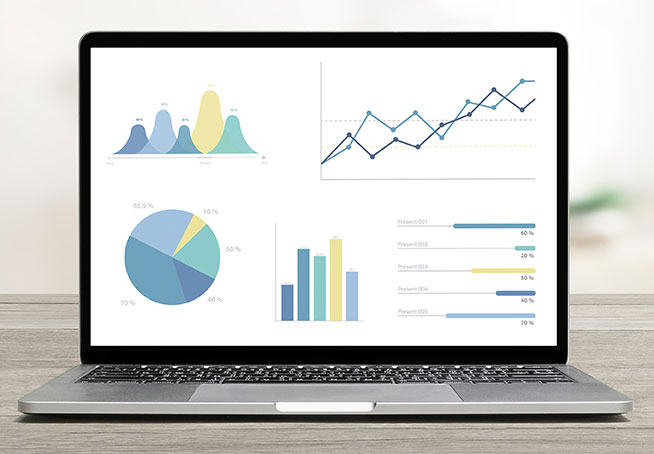
Did you know charts and graphs are an excellent way to illustrate relationships in data and highlight trends in IBM Planning Analytics Workspace? They are visualizations of data that allow end users to quickly analyze a large amount of data. To make the biggest impact, it is important to choose the right chart for the use case of the data.
In less than 45 minutes, you will learn about the following charts:
-
-
- Area charts
- Bar charts
- Stacked bar charts
- Column charts
- Stacked column charts
- Line charts
- Map charts
- Packed bubble charts
- Pie charts
- Point utilization charts
- Radial charts
- And so much more!
-
If you have any questions or would like to receive a recorded version of this webinar, please contact us at info@revelwood.com.
Register today.