Pie charts are a type of visualization known as composition. Composition charts are designed to show the parts of a whole. This is a great way to look at the pieces of total. For example, the branches in a region or the months in a year.
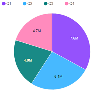
Here is an example of a pie chart that shows operating expenses for a year:

The great thing about this chart is that you can easily see the numbers for each quarter. I can also quickly see comparative values such as Q1 being much larger than Q4. However, what I cannot see is the total for the year.
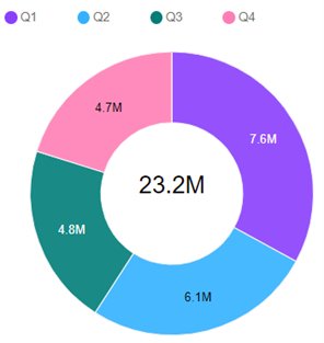
IBM Planning Analytics Workspace allows you to include a “donut hole” and include the total in the center of the pie. This is enabled within the chart area of the properties by defining the radius percent.

When combined with the option to “show inner label”, here is an example of the same chart with a donut hole of 50%:

This approach will help you expand your use of comparative pie charts.
IBM Planning Analytics, which TM1 is the engine for, is full of new features and functionality. Not sure where to start? Our team here at Revelwood can help. Contact us for more information at info@revelwood.com. And stay tuned for more Planning Analytics Tips & Tricks weekly in our Knowledge Center and in upcoming newsletters!
Read more about visualizations in IBM Planning Analytics:
IBM Planning Analytics Tips & Tricks: Scatter Chart vs Bubble Chart

