IBM Planning Analytics Workspace (PAW) includes various visualizations that can be used to view your data. One of these visualizations entails a chart called a waterfall chart. This type of chart will help you show the components of a summarized number and is very helpful in determining which values are beneficial to the total and which values are detrimental.
The image below shows an exploration and its corresponding waterfall chart.

- The chart shows information about each region while also defining each region as a positive (green) or negative (red) amount, which makes it easy to determine what is adding to the total and what is reducing the total.
- The chart makes it easy to compare regions against each other, which allows you to quickly see that the Northeast gross profit is much larger than the West.
- The chart allows users to look at the pieces as a rough percentage of the total, which lets you see that the Northeast accounts for more than half of the total.
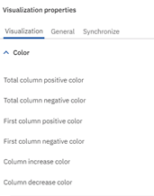
PAW also allows you to customize various aspects of the chart, including colors for each bar.

The combination of an exploration and a waterfall chart can be used as the starting point for a user friendly dashboard in PAW.
IBM Planning Analytics, which TM1 is the engine for, is full of new features and functionality. Not sure where to start? Our team here at Revelwood can help. Contact us for more information at info@revelwood.com. And stay tuned for more Planning Analytics Tips & Tricks weekly in our Knowledge Center and in upcoming newsletters!
Read more IBM Planning Analytics Tips & Tricks:
IBM Planning Analytics Tips & Tricks: IBM Planning Analytics Workspace Chart Types
IBM Planning Analytics Tips & Tricks: Visualizing Data into Pie Charts
IBM Planning Analytics Tips & Tricks: Hiding Dimensions in Planning Analytics Workspace

