Did you know that IBM Planning Analytics Workspace (PAW) allows you to “split” your pie chart widget to define how much of the space is allocated to the legend and how much of the space is allocated to the chart?
While in edit mode, you can view and modify the split by moving your mouse over the widget. You will then see a bar appear that can be used to resize the split.
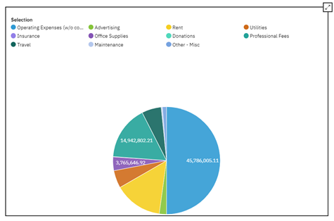
Here is an example of a chart with a legend:

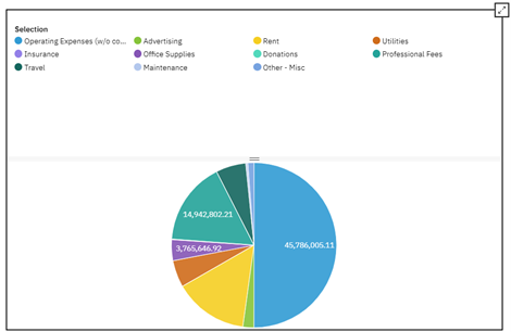
Here is the same chart with my mouse hovering in the legend area of the widget:

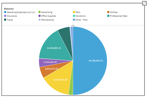
And here is the result of dragging the bar up:

You can see that the chart is now larger since less area was allocated to the legend.
Interested in learning more about charts and graphs in IBM Planning Analytics Workspace? Watch our webinar, “Best Practices When Using IBM Planning Analytics Workspace Charts.”
IBM Planning Analytics, powered by TM1, is full of new features and functionality. Need advice? Our team here at Revelwood can help. Contact us for more information at info@revelwood.com. We post new Planning Analytics Tips & Tricks weekly in our Knowledge Center and in newsletters.
Read more IBM Planning Analytics Tips & Tricks:
IBM Planning Analytics Tips & Tricks: Planning Analytics Workspace (PAW) Tab Icons
IBM Planning Analytics Tips & Tricks: Planning Analytics Workspace (PAW) Tab Colors
IBM Planning Analytics Tips & Tricks: Planning Analytics Workspace (PAW) Gridlines

