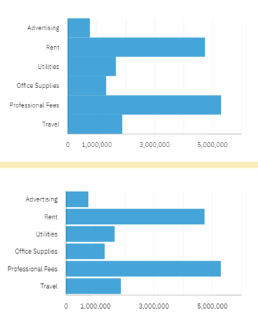
Did you know that IBM Planning Analytics Workspace (PAW) offers a feature calling “padding” which defines lines are separated within a chart? The concept of padding is the equivalent of defining white space in between the lines (e.g., no padding) or making the lines touch the lines above and below (e.g., padding).
The setting is located within the chat area of the visualization properties. It is defined as a binary option so you can choose to enable it or disable it.

Here is an example of the same chart via both options. The chart on the top has padding enabled (e.g., the option is not checked) and the chart on the bottom has padding disabled.

By defining whitespace around your charts, you make your data more readable.
IBM Planning Analytics, powered by TM1, is full of new features and functionality. Need advice? Our team here at Revelwood can help. Contact us for more information at info@revelwood.com. We post new Planning Analytics Tips & Tricks weekly in our Knowledge Center and in newsletters.
Read more IBM Planning Analytics Tips & Tricks:
IBM Planning Analytics Tips & Tricks: Pie Chart Sizing
IBM Planning Analytics Tips & Tricks: IBM Planning Analytics Workspace Tab Icons
IBM Planning Analytics Tips & Tricks: IBM Planning Analytics Workspace Tab Colors

