A scatter chart is used to show relationships within your data. This type of chart is great to see patterns and groupings over a large set of values. A bubble chart is also used to show relationships and it also great to see patterns. So what is the difference between the two types of charts?
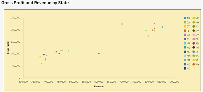
A scatter chart is used to show the correlation of two data sets that have different ranges of values. The IBM Planning Analytics Workspace (PAW) example below shows the correlation of revenue and gross profit.

The values associated with gross profit range from approx. 50,000 to 250,000. The values associated with revenue range from approx. 350,000 to 850,000. The scatter chart allows you to put these two different data sets onto the same chart and therefore see patterns. In this case, we see a positive correlation between larger revenue and larger profit … thereby telling us that our indirect costs are somewhat symmetrical to our direct costs.
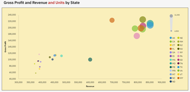
But what if we also want to know how the number of units impacts these numbers? This cannot be done on a simple two dimensional chart, but it can be done by adjusting the size of the dots within the chart. This adjustment approach is the purpose of a PAW bubble chart.
Here is the same set of data with the inclusion of units:

In both situations you can see the correlation in the data by looking at the patterns. However, the bubble chart also gives you information on the units by adjusting the size of the dots. This gives us another positive correlation between larger unit sales and larger revenue … thereby telling us that we may have the opportunity to introduce regional pricing.
As you can see, the type of chart makes a difference when reviewing your data. So how do you decide which chart to use? The simple answer is to ask yourself how many details do you want to see at once? Are you looking for two correlations or more? As long as your picture answers that question, you can never go wrong!
IBM Planning Analytics, powered by TM1, is full of new features and functionality. Need advice? Our team here at Revelwood can help. Contact us for more information at info@revelwood.com. We post new Planning Analytics Tips & Tricks weekly in our Knowledge Center and in newsletters.
Read more IBM Planning Analytics Tips & Tricks:
IBM Planning Analytics Tips & Tricks: Pie Chart Sizing

