A line chart is typically used to show values over time. This type of chart is great to see trends with your data. An area chart is also used to show values over time and is sometimes referenced as a line chart with the area below the line filled. While this is the case in IBM Planning Analytics Workspace (PAW) for a chart that contains a single line, it is not the case for a chart with multiple lines.
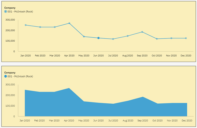
Here is a simple line chart in PAW and the related area chart:

In both situations, you can see the trend and you can also see the values.
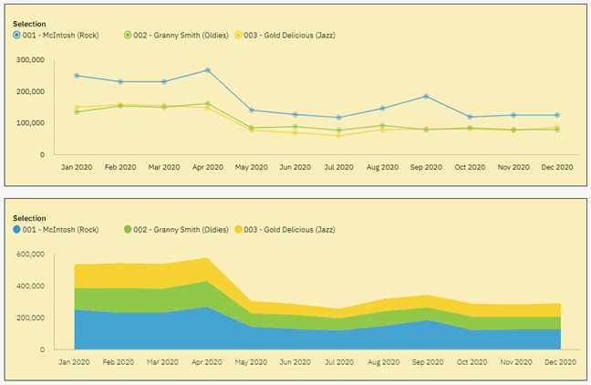
Here are the same PAW charts with multiple lines (e.g., multiple companies):

In both situations you can again see the trends in the data by looking at the flows from left to right. However, you do not see the same values in the two reports. You can see this by looking at the labels on the Y-axis. The line chart is designed to show a set of independent values and therefore allows you to see the values for each company. The area chart is designed to show the accumulation of the values, which makes it hard to determine values for anything except for the bottom element.
As you can see, the type of chart makes a difference when reviewing your data. So how do you decide which chart to use? The simple answer is to ask yourself what you are looking to see. Are you looking for separate values or accumulated values? As long as your picture answers that question, you can never go wrong!
IBM Planning Analytics, powered by TM1, is full of new features and functionality. Need advice? Our team here at Revelwood can help. Contact us for more information at info@revelwood.com. We post new Planning Analytics Tips & Tricks weekly in our Knowledge Center and in newsletters.
Read more IBM Planning Analytics Tips & Tricks:
IBM Planning Analytics Tips & Tricks: Scatter Charts vs Bubble Charts

