Pie charts are one of the most common types of data visualizations. A pie chart is defined as a component report, which means that it is design to show part-to whole relationships. This approach makes it easy to get a general sense of how much each piece of the pie contributes to the total.
But what does “each piece” mean to you? Does it mean a value or does it mean a percentage? IBM Planning Analytics Workspace (PAW) makes it easy to create your preferred approach via a single setting.
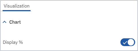
This is done by enabling or disabling the property called “Display %” that is found within the Chart settings of the Visualization area.

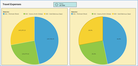
Enabling this option will show percentages within the pie pieces and disabling this option will show values. All of this assumes that the setting for “Show value labels” is enabled.
Here is an example of the same chart using each of the options:

This flexibility allows you to analyze your pie charts using your preferred approach.
IBM Planning Analytics, which TM1 is the engine for, is full of new features and functionality. Not sure where to start? Our team here at Revelwood can help. Contact us for more information at info@revelwood.com. And stay tuned for more Planning Analytics Tips & Tricks weekly in our Knowledge Center and in upcoming newsletters!

