Did you know you can easily visualize data with IBM Planning Analytics Workspace? IBM Planning Analytics Workspace (PAW) allows you to visualize your data using a variety of charts and graphs, including the ability to display your results via a map. The only requirement for mapping is to ensure that your geography dimension includes recognizable place names. IBM defines “recognizable” to include items such as countries, states and provinces and offers a list of acceptable items on their website.
You can create a map in PAW with three easy steps:
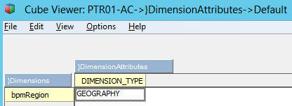
1. Ensure that your dimension type is defined as geography within the }DimensionAttributes cube.

2. Create a view in PAW with either your rows or columns displaying the geography dimension.

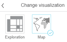
3. Set your visualization type to be a map.

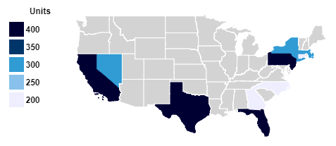
The resulting display will appear as a map:

Planning Analytics will re-analyze the data set each time you refresh the values. If at least 80% of the row or column members are recognized as geographic map values then PAW will re-create the map. This will allow you to quickly shift between worldwide, nationwide and regional maps by simply changing and suppressing the values you want to display.
IBM Planning Analytics is full of new features and functionality. Not sure where to start? Our team here at Revelwood can help. Contact us for more information at info@revelwood.com. And stay tuned for more Planning Analytics Tips & Tricks weekly in our Knowledge Center and in upcoming newsletters!
Read more IBM Planning Analytics Tips & Tricks:
Tips & Tricks for using TM1: Variance Analysis in IBM Cognos TM1
IBM Planning Analytics Tips & Tricks: Creating Dynamic, Attractive Views and Dashboards
Tips & Tricks for Using IBM Planning Analytics – Creating TM1/Planning Analytics Picklist Cubes

