• Skip to primary navigation
  • Skip to main content
  • Skip to footer
Revelwood

Revelwood

  • Who We Are
    • About Us
      • Our Company
      • Our Team
      • Partners
    • Careers
      • Join Our Team
  • What We Do
    • SOLUTIONS
      • Workday Adaptive Planning
      • IBM Planning Analytics
      • BlackLine
    • SERVICES
      • Implementation Services
      • Advisory Services
      • Customer Care
        • Help Desk
        • System Admin
        • Performance Tune-Up
      • Training
        • Workday Adaptive Planning Training
        • IBM Planning Analytics / TM1 Training
    • PRODUCTS
      • DataMaestro
      • Lightspeed Planning & Reporting
      • IBM Planning Analytics Utilities
  • How We Help
    • Workday Adaptive Planning Use Cases
    • IBM Planning Analytics Use Cases
    • Client Success Stories
  • How We Think
    • Knowledge Center
    • Events
    • News
    • User Groups
  • Contact Us

IBM Planning Analytics Tips & Tricks: PAW Lines vs Area for Multiple Elements

IBM Planning Analytics Tips & Tricks

IBM Planning Analytics Tips & Tricks: PAW Lines vs Area for Multiple Elements


Tips & Tricks

August 10, 2021

By Lee Lazarow

A line chart is typically used to show values over time. This type of chart is great to see trends with your data. An area chart is also used to show values over time and is sometimes referenced as a line chart with the area below the line filled. While this is the case in IBM Planning Analytics Workspace (PAW) for a chart that contains a single line, it is not the case for a chart with multiple lines.

Here is a simple line chart in PAW and the related area chart:

IBM Planning Analytics Tips & Tricks: PAW Line vs Area for Multiple Elements

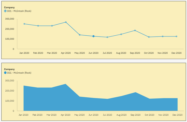
In both situations, you can see the trend and you can also see the values.

Here are the same PAW charts with multiple lines (e.g., multiple companies):

IBM Planning Analytics Tips & Tricks: PAW Line vs Area for Multiple Elements

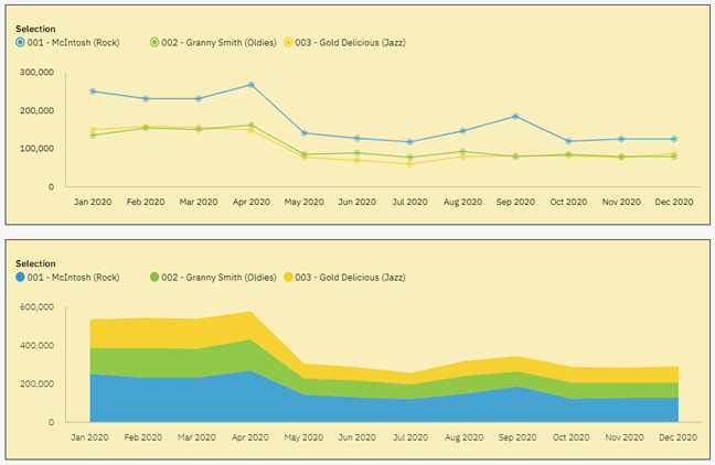
In both situations you can again see the trends in the data by looking at the flows from left to right. However, you do not see the same values in the two reports. You can see this by looking at the labels on the Y-axis. The line chart is designed to show a set of independent values and therefore allows you to see the values for each company. The area chart is designed to show the accumulation of the values, which makes it hard to determine values for anything except for the bottom element.

As you can see, the type of chart makes a difference when reviewing your data. So how do you decide which chart to use? The simple answer is to ask yourself what you are looking to see. Are you looking for separate values or accumulated values? As long as your picture answers that question, you can never go wrong!

IBM Planning Analytics, powered by TM1, is full of new features and functionality. Need advice? Our team here at Revelwood can help. Contact us for more information at info@revelwood.com. We post new Planning Analytics Tips & Tricks weekly in our Knowledge Center and in newsletters.

Read more IBM Planning Analytics Tips & Tricks:

IBM Planning Analytics Tips & Tricks: Scatter Charts vs Bubble Charts

IBM Planning Analytics Tips & Tricks: The Waterfall Chart

IBM Planning Analytics Tips & Tricks: PAW Chart Padding

    • Categories

      • Awards & Recognition
      • FP&A Done Right
      • IBM Planning Analytics Tips & Tricks
      • Modern Accounting
      • News & Events
      • Success Stories
      • Tech Bulletins
      • Workday Adaptive Planning Insights
      • Workday Adaptive Planning Tips & Tricks

    Popular Posts

    • Workday Adaptive Planning Tips & Tricks: The Formula Assistant – How To, Where & Why
    • Workday Adaptive Planning Tips & Tricks: Templates
    • IBM Planning Analytics Tips & Tricks: Troubleshooting Planning Analytics for Excel
    • Workday Adaptive Planning Named a Leader in Gartner Magic Quadrant for Cloud Financial Planning and Analysis Solutions 2020
    • Workday Adaptive Planning Tips & Tricks: Excel Reporting Using a Report Template

    Sign up for our newsletter

    Connect

    Authors

    • John Pra Sisto
    • Revelwood
    • Adam Riskin
    • Ailenette Cruz
    • Brian Combs
    • Dave Miersch
    • Dillon Rossman
    • Gary Leiffer
    • Ken Wolf
    • Koury Reid
    • Lee Lazarow
    • Lisa Minneci
    • Marc Assenza
    • Mary Luchs
    • Michelle Song
    • Nina Inverso
    • Summer Jeter
    • Tara Byrnes
    • Thanh Chau
    • Wesley DeMarco

Footer

Revelwood Overview

Revelwood helps finance organizations close, consolidate, plan, monitor and analyze business performance. As experts in solutions for the Office of Finance, we partner with best-in-breed software companies by applying best practices guidance and our pre-configured applications to help businesses achieve their full potential.

EXPERTISE

  • Workday Adaptive Planning
  • IBM Planning Analytics
  • BlackLine

ABOUT

  • Who We Are
  • What We Do
  • How We Help
  • How We Think
  • Privacy

CONNECT

Contact:
25B Vreeland Road, Suite 111
Florham Park, NJ 07932

201.984.3030
info@revelwood.com

© Revelwood Inc. All rights reserved. Revelwood® and the Revelwood logo are registered marks of Revelwood Inc. 

FP&A Done Right: Overcoming Obstacl

FP&A Done Right

What-if Analysis in Workday Adaptive Planning

Planning in Workday Adaptive Planning

Videos