
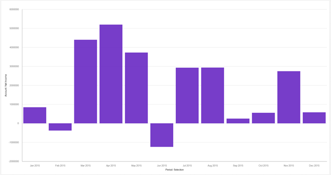
Do you know how to add value labels for Planning Analytics Workspace (PAW) visualizations? On the column visualization below, you can see the bars but you cannot see the exact amount of each column.
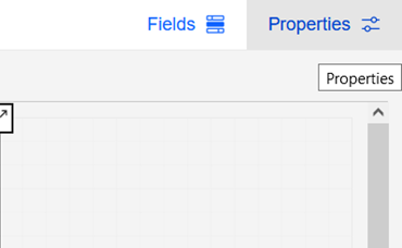
To enable value labels, ensure that you are in “Edit” mode for your PAW book, click on your visualization, and then click “Properties” in the top right corner.
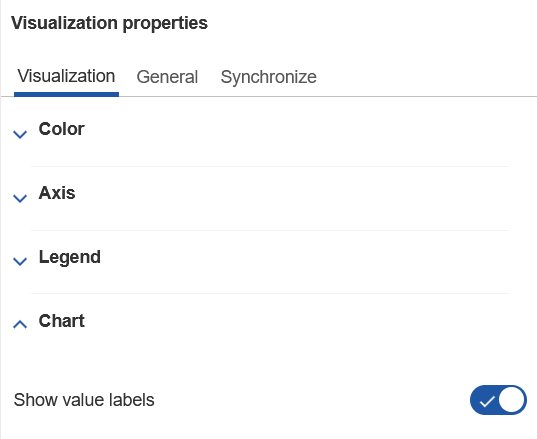
Within the “Properties” menu, click on the “Visualization” tab then expand the “Chart” section. You will see a setting called “Show value labels.”
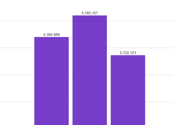
Once this setting is enabled, value labels will appear on the visualization showing the exact amount for each column.
IBM Planning Analytics, powered by TM1, is full of new features and functionality. Need advice? Our team here at Revelwood can help. Contact us for more information at info@revelwood.com. We post new Planning Analytics Tips & Tricks weekly in our Knowledge Center and in newsletters!
Read more IBM Planning Analytics Tips & Tricks:
IBM Planning Analytics Tips & Tricks: Refresh PAW Visualizations Automatically
IBM Planning Analytics Tips & Tricks: PAW Tab Colors
IBM Planning Analytics Tips & Tricks: PAW Tab Icons