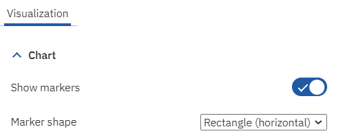
A line chart can either be a simple line or it can include markers for each data point. Most people associate a marker as a simple dot, but did you know that IBM Planning Analytics Workspace (PAW) allows you to configure the shape of the markers?
This is done by enabling the property called “Show markers’ and then defining a value for the property called “Marker Shape.” Both of these settings are found within the Chart settings of the Visualization area.

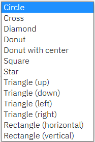
In addition to a circle, PAW offers a variety of shapes that you can use on your chart.

This flexibility allows you to customize your line charts and enhance your end user experience.
IBM Planning Analytics, powered by TM1, is full of new features and functionality. Need advice? Our team here at Revelwood can help. Contact us for more information at info@revelwood.com. We post new Planning Analytics Tips & Tricks weekly in our Knowledge Center and in newsletters.
Read more IBM Planning Analytics Tips & Tricks:
IBM Planning Analytics Tips & Tricks: PAW Chart Padding
IBM Planning Analytics Tips & Tricks: Planning Analytics Workspace Tab Icons
IBM Planning Analytics Tips & Tricks: Planning Analytics Workspace Tab Colors

