
Did you know IBM Planning Analytics Workspace (PAW) allows you to visualize your data using a variety of charts and graphs, including the ability to display your results via a pie chart? In order to create a pie chart, you must follow one simple rule: ensure that you have only one “measure” element on either the row or the column.
You can create a pie chart in PAW with three easy steps:
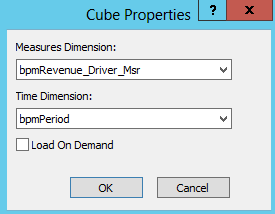
1. Ensure that a dimension is defined as the measure by right clicking on the cube name within Server Explorer and then selecting the option for properties.
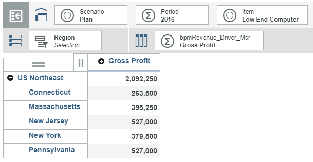
2. Create a view in PAW with either the rows or the columns displaying a single element from the measure dimension.
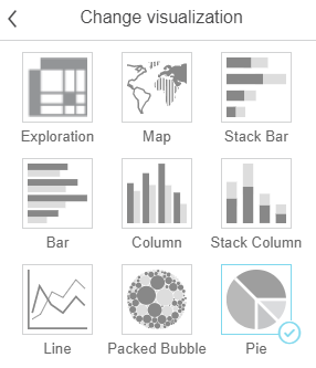
3. Set your visualization type to be a pie.
The resulting display will appear as a pie chart:
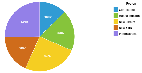
Once the pie chart is created, you can use PAW to change the appearance of the colors, the legend and other details.
IBM Planning Analytics is full of new features and functionality. Not sure where to start? Our team here at Revelwood can help. Contact us for more information at info@revelwood.com. And stay tuned for more Planning Analytics Tips & Tricks weekly in our Knowledge Center and in upcoming newsletters!