Are you familiar with Sparklines, a rarely used feature in Excel?
What happens when you’d like to provide a visual representation of data but don’t necessarily want, or have the space, for a big chart? Sparklines may be a viable solution.
To add a Sparkline for data, follow these steps:
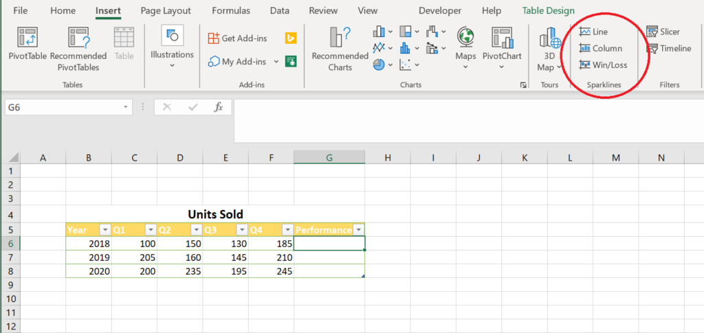
- Once you have your data, navigate to the Insert Tab > Sparklines. In this scenario a Line Sparkline will be used but there are also options for Column and Win-Loss Sparklines.

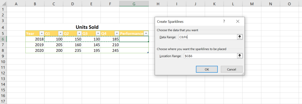
- Once selected, a dialogue box will show two fields:
- A. Data Range – Data that will appear in the Sparkline
- B. Location Range – Where the Sparkline will be placed

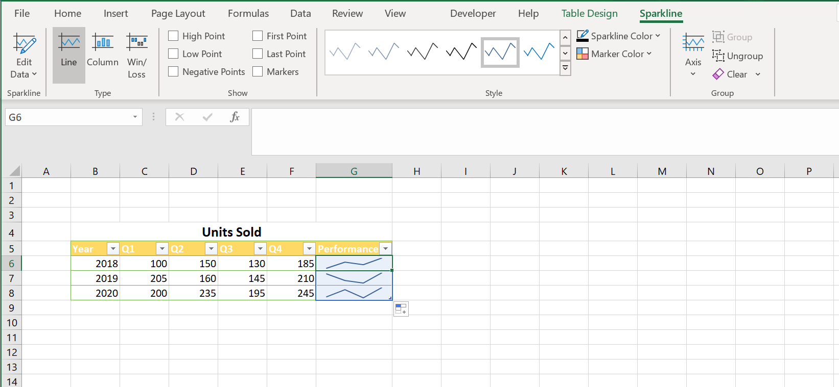
- After filling out the necessary fields, a Sparkline will be created, and the Sparkline Tab will appear. This provides several options to change the appearance of a Sparkline.

Implementing Sparklines is a very easy and effective way to visualize data without the need for charts.
IBM Planning Analytics, which TM1 is the engine for, is full of new features and functionality. Not sure where to start? Our team here at Revelwood can help. Contact us for more information at info@revelwood.com. And stay tuned for more Planning Analytics Tips & Tricks weekly in our Knowledge Center and in upcoming newsletters! You can also sign up to get our Planning Analytics Tips & Tricks sent directly to your inbox!
Read more IBM Planning Analytics Tips & Tricks:
IBM Planning Analytics Tips & Tricks: New Configuration Setting for Dates
IBM Planning Analytics Tips & Tricks: New Parameters for TurboIntegrator

