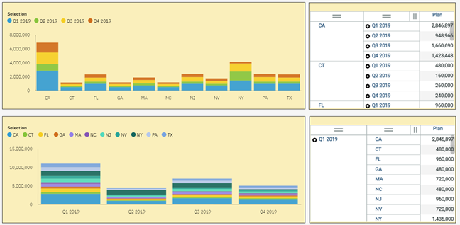
Column charts are one of the most common types of data visualizations and stacked columns are simply an expansion of the columns. The stacking allows you to compare two sets of data within the same chart. But have you ever thought about how the order of the stacking will impact your chart?
IBM Planning Analytics Workspace (PAW) creates a stacked column report as follows:
- Define the columns based on the outside dimension
- Then define the columnar breakdown based on the inside dimension
This order of operations will help you determine which dimension should be on the outside of your exploration and which dimension should be on the inside. Here is an example of the same set of data using two different stacking approaches:

As you can see, the stacking order makes a difference when generating the chart.
So how do you stack your dimensions? The proper approach is to first determine the goal of the chart by defining “what question am I trying to answer?” As long as your picture answers that question, you can never go wrong!
IBM Planning Analytics, which TM1 is the engine for, is full of new features and functionality. Not sure where to start? Our team here at Revelwood can help. Contact us for more information at info@revelwood.com. And stay tuned for more Planning Analytics Tips & Tricks weekly in our Knowledge Center and in upcoming newsletters!
Get more IBM Planning Analytics Tips & Tricks:
IBM Planning Analytics Tips & Tricks: PAW Explorations – Row & Column Headers
IBM Planning Analytics Tips & Tricks: Columns and Sections of Stacked Columns
IBM Planning Analytics Tips & Tricks: PAW Lines vs Area for Multiple Elements

