Did you know you are able to create custom axis labels for IBM Planning Analytics Workspace (PAW) visualizations? Below is a column visualization that shows periods on the x-axis and a net income amount on the y-axis. As you can see, a generic description appears for both titles.
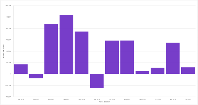
While this generic wording does properly define the axis, you may to change the wording of the titles to something more user friendly.
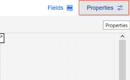
While in “Edit” mode for your PAW book, click on your visualization then click “Properties” in the top right corner.
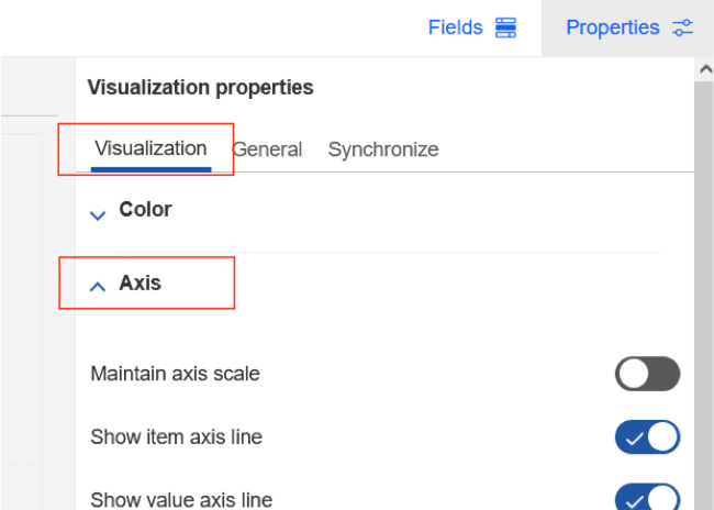
Within the “Properties” menu, click on the “Visualization” tab then expand the “Axis” section.
Scroll down until you see “Item axis title” and “Value axis title”.
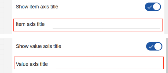
The “Item axis title” corresponds with the x-axis, and the “Value axis title” corresponds with the y-axis. This may change based on the visualization selected. We can use this approach to create a more user friendly description on each axis such as to “Month” and “Net Income $”.
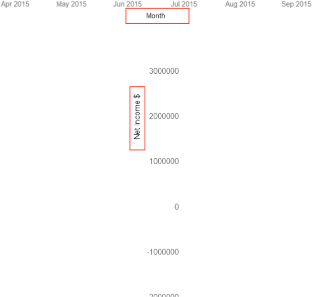
We now have custom axis labels. You are also able to customize the font, color, and orientation of these labels.
IBM Planning Analytics, powered by TM1, is full of new features and functionality. Need advice? Our team here at Revelwood can help. Contact us for more information at info@revelwood.com. We post new Planning Analytics Tips & Tricks weekly in our Knowledge Center and in newsletters!
Read more IBM Planning Analytics Tips & Tricks:
IBM Planning Analytics Tips & Tricks: Refresh PAW Visualizations Automatically
IBM Planning Analytics Tips & Tricks: PAW Visualization Value Labels

