• Skip to main content
  • Skip to footer
Revelwood Logo

Revelwood

Your SUPER-powered WP Engine Site

  • Who We Are
    • About Us
      • Our Company
      • Our Team
      • Partners
    • Careers
      • Join Our Team
  • What We Do
    • Solutions
      • Workday Adaptive Planning
      • IBM Planning Analytics
      • BlackLine
    • Services
      • Implementation Services
      • Customer Care
        • Help Desk
        • System Administration as a Service
      • Training
        • Workday Adaptive Planning Training
        • IBM Planning Analytics / TM1 Training
    • Products
      • DataMaestro
      • LightSpeed
      • IBM Planning Analytics Utilities
  • How We Help
    • Use Cases
    • Client Success Stories
  • How We Think
    • Knowledge Center
    • Events
    • News
  • Contact Us

dashboards

FP&A Done Right: 5 Ways Dashboards Empower The Office of Finance

April 23, 2021 by Revelwood Leave a Comment

This is a guest blog post from our partner Workday Adaptive Planning, exploring how to unlock hidden opportunities with dashboards & analytics.

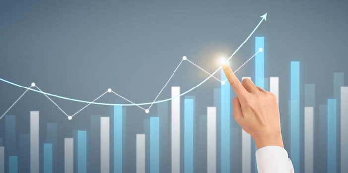
Visualizing data is often the fastest way to identify trends and patterns that lead to insights and better decision making. That’s because the simple clarity of visualizing data via interactive dashboards can reveal hidden opportunities that likely would have been missed in more traditional analysis and sharing of data.

Here are five ways dashboards can help identify valuable insights that may have been overlooked in the past.

1. Dashboards encourage company-wide planning (or xP&A)

Simply making dashboards accessible to stakeholders throughout the organization represents a huge win in itself—and a significant step toward breaking down silos. Yet beyond that, increasing the number of people who have access to data presented in digestible formats exponentially increases the chances of those aha moments occurring. The production floor manager will surely have a different perspective than the CFO. When that perspective is informed with accessible data delivered via a dashboard, the stage is set for new efficiencies and improved productivity.

2. Dashboards show instead of tell

There’s a reason the phrases “go through the numbers” and “eyes glaze over” are often uttered in the same sentence. Traditionally, delivering financial information has largely been a one-way conversation with the finance team presenting mundane reports and data downloads. With the exception of the number crunchers in finance and accounting, many business partners get lost or disinterested when presented with a number or data overload. Dashboards avoid this challenge by elevating the data to the next level and using graphics and visualizations to clearly show data in formats that provide key context and clarity. When data gets presented in highly visual and familiar formats, business users can often quickly see challenges and opportunities that otherwise might have been missed.

3. Dashboards offer customized views for different thinkers

Different people consume information in a wide range of ways. Some may be more comfortable viewing data presented in standard bar, column, gauge, area, and doughnut charts. Yet others benefit from data presented in more engaging or interactive formats. Workday Adaptive Planning dashboards feature data visualization that includes funnels, dials, waterfalls, bubbles, histograms, radars, and Pareto charts. Users across locations and on any device can view data in the formats that connect with their unique way of learning and thinking.

4. Dashboards are ever-present

Even finance pros and business leaders who are adept at extracting insights from traditional reporting face the challenge of locating reports once they are filed away. And once people find the report, they have the time-consuming process of checking if the data is still accurate. Conversely, dashboards are continuously available via a wide range of devices with data updated in real time, assuring users that they are working with the latest available information. So if conditions change or a new opportunity arises, easy-to-access data visualization is there to support decision-making and reveal how an opportunity may be quickly leveraged.

5. Dashboards are inviting and simple to use

The simple power of dashboards is that they are easy to use and invite users to experiment, explore, and discover. By eliminating the complexity barrier, the odds of uncovering hidden opportunities expand dramatically. Ultimately, dashboards create the opportunity for self-service analysis for everyone. That allows any user to perform drilldown analytics, create period-to-period comparisons, and explore iterative what-if analyses that can effectively identify issues that need immediate attention while also identifying trends that could be leveraged through sales and targeted marketing efforts.

This blog post was originally published on the Workday Adaptive Planning blog.

Home » dashboards

Filed Under: FP&A Done Right Tagged With: Adaptive Insights, Adaptive Planning, dashboards, FP&A, FP&A done right, Workday Adaptive Planning, xP&A

FP&A Done Right: The Path to Great Reporting

February 28, 2020 by Revelwood Leave a Comment

FP&A Done Right

This is a guest blog post from our partner Workday Planning, written by Gary Cokins. Cokins discusses some of the challenges with traditional financial reporting processes.  

For FP&A, financial reporting is a tricky balancing act.

If you share too many reports, business leaders may give up reading them all together. They are saturated. In a study by the American Institute of CPAs and the Chartered Institute of Management Accountants, 32% of C-level executives said more data has made things worse, not better, for decision-making.

But if you offer bare-bones financial reporting, stakeholders scream for more relevant data and timely information. Case in point: That same survey found 70% of C-level executives saying at least one strategic initiative failed in the last three years due to delays in strategic decision-making. So how do you find the balance of not overwhelming your business partners while still getting them the information they need?

They need facts because in the absence of facts, anybody’s opinion is a good one. And usually the biggest opinion wins, which is likely managers at the top of the org chart. So to the degree they are making decisions on gut feel, intuition, flawed and misleading information, or office politics, an organization is at risk.

Here are three proven steps:

Step #1: Survey users

Your CEO needs access to different data than the manager of HR. Yet there’s also a good chance that they may be interested in some of the same information. And even within the same departments, managers may seek different information. Managers have varying requirements and goals; some prefer a very high-level overview, while others want specific information and a lot of granular details.

So what’s a finance team to do?

It sounds simple, but it begins with good communication. Talk to users and find out what they want and why they want it. Ask what types of decisions they will make with better information. Delve into how they would like reports presented and how often they need them. From time to time, follow up with a brief meeting or a simple survey to ensure that managers are using reports and if there is any new information that would be useful.

Of course, it’s essential to continue to make ongoing investments in technology that ensure you can deliver the reports that business partners are looking for in user-friendly formats. Technology investments not only save FP&A time—which allows for a more thoughtful and strategic approach to generating relevant reports—they also have a measurable impact on the bottom line. A study conducted by Nucleus Research found the average return from each dollar spent on analytics technology was $13.01.

Step #2: Customize dashboards

A key strength of technology investments is dashboard technology. Dashboards have revolutionized reporting, dramatically reducing the mountains of spreadsheets with racked-and-stacked tables that find their way to managers and department heads via email or hard copy. So make sure you are making the most of the technology by working with users to customize dashboards so they can access the reports they want and in a format that is most useful to them.

A customized dashboard allows managers to do a better job by measuring and monitoring performance as well as proactively shaping business outcomes through real-time awareness of financial and sales data. Dashboards are also a powerful tool to track your company’s actual broader performance against your planned expectations and goals, year to date.

When it comes to dashboards, a quick demo can go a long way. You can show users the power of data visualization presented in a range of formats from standard bar, column, or doughnut charts to more engaging funnel, waterfall, and bubble graphics. And you can demonstrate how they can generate their own reports to gain even further insight into their team’s performance and how it impacts the entire organization.

These visualization tools have proven to be game-changers in terms of making reports accessible and understandable to a wide range of users. As a TechTarget writer recently pointed out: “Without (data visualizations), analytics teams are engaging in a nearly impossible task that’s tantamount to flying an airplane while blindfolded.”

Step #3: Track results

It’s often said that what gets measured gets done. It’s also often said that if you cannot measure it, you cannot manage it, and if you cannot manage it, you cannot improve it. With that in mind, one way to ensure that relevant reports are being generated is to assess whether they are leading to measurable results.

Have reports resulted in greater efficiency, changes in behavior, or an uptick in sales and profits? Internally, are the reports helping drive collaboration and more insightful conversations? If not, why? You may need a deeper dive into whether the right information is getting into the right hands at the right time.

Opening lines of communication with business partners is key. Discuss targeted outcomes and then identify the reporting—or tweaks to reporting—that will provide the real-time data and insights to drive better results. Adaptive Insights customer Cumulus Media successfully applied this approach, instituting self-service reporting so users across the organization can create and run reports on demand. The result: It now takes just seconds—not days—to access and analyze business performance data relevant to each manager.

Finally, celebrate and highlight success. If a certain department is delivering big wins by leveraging insights from the reports it is receiving and generating, then promote and broadcast that throughout the organization. Success will breed success.

Good reporting leads to better results

Of course, it’s important to remember that when it comes to reports, finance should be a facilitator and strategic partner, not a hand-holder. Managers need to be self-sufficient. But it’s important to put the relevant information in their hands so they don’t have to track down finance every time they have a question.

Ultimately, good reporting leads to better results. By identifying and delivering the reports that leaders and managers throughout your organization need, FP&A can make a big impact and solidify its role as a strategic business partner. Finance has the opportunity to expand from bean counters to bean growers.

Gary Cokins is an internationally recognized expert, speaker, and author in enterprise and corporate performance management (EPM/CPM) systems. He is the founder of Analytics-Based Performance Management LLC. Gary can be reached at gcokins@garycokins.com

This blog post was originally published on the Workday Adaptive Planning blog.

Home » dashboards

Filed Under: FP&A Done Right Tagged With: Adaptive Insights, Analytics, Budgeting, Budgeting Planning & Forecasting, dashboards, Financial Performance Management, financial reporting, Planning & Forecasting, Planning & Reporting

New Video Demo – Creating Dashboards in IBM Planning Analytics

September 18, 2019 by Lisa Minneci Leave a Comment

Video

In the third video of our series Creating a Cube in IBM Planning Analytics, Revelwood’s FP&A Technology Director, Lee Lazarow, demonstrates how to create a dashboard in IBM Planning Analytics. Watch this short video demo to learn how to create a dashboard from the sales cube built in the second video, using both a drag and drop methodology and Planning Analytics’ built-in wizard.

In this video, Lee demonstrates the results of sales commissions in the dashboard, as well as how to:

  • Change views
  • Create simplistic views of data for quick analysis
  • Visualize a set of numbers
  • Build different types of charts
  • Merge separate sets of data

Lee also demonstrates Planning Analytics’ built-in intelligence that shows which charts are best for your particular data.

Did you miss the first two videos in this series? Watch Creating Dimensions Planning Analytics and Creating a Cube in Planning Analytics.

Subscribe to our YouTube Channel and follow our playlist to watch the entire series How to Create a Cube in IBM Planning Analytics.

Home » dashboards

Filed Under: IBM Planning Analytics Tips & Tricks, Videos Tagged With: Analytics, Budgeting, Budgeting Planning & Forecasting, dashboarding, dashboards, Financial Performance Management, IBM Cognos TM1, IBM Planning Analytics, Planning & Forecasting, Planning & Reporting, TM1

Footer

Revelwood Overview

Revelwood helps finance organizations close, consolidate, plan, monitor and analyze business performance. As experts in solutions for the Office of Finance, we partner with best-in-breed software companies by applying best practices guidance and our pre-configured applications to help businesses achieve their full potential.

EXPERTISE

  • Workday Adaptive Planning
  • IBM Planning Analytics
  • BlackLine

ABOUT

  • Who We Are
  • What We Do
  • How We Help
  • How We Think
  • Privacy

CONNECT

World Headquarters

Florham Park, NJ | 201 984 3030

European Headquarters

London & Edinburgh | +44 (0)131 240 3866

Latin America Office

Miami, FL | 201 987 4198

Email
info@revelwood.com

Copyright © 2025 · Revelwood Inc. All rights reserved. Revelwood® and the Revelwood logo are registered marks of Revelwood Inc.