• Skip to main content
  • Skip to footer
Revelwood Logo

Revelwood

Your SUPER-powered WP Engine Site

  • Who We Are
    • About Us
      • Our Company
      • Our Team
      • Partners
    • Careers
      • Join Our Team
  • What We Do
    • Solutions
      • Workday Adaptive Planning
      • IBM Planning Analytics
      • BlackLine
    • Services
      • Implementation Services
      • Customer Care
        • Help Desk
        • System Administration as a Service
      • Training
        • Adaptive Planning Training
        • IBM Planning Analytics / TM1 Training
    • Products
      • DataMaestro
      • LightSpeed
      • IBM Planning Analytics Utilities
  • How We Help
    • Workday Adaptive Planning Use Cases
    • IBM Planning Analytics Use Cases
    • BlackLine Use Cases
    • Client Success Stories
  • How We Think
    • Knowledge Center
    • Events
    • News
  • Contact Us

PAW visualization

IBM Planning Analytics Tips & Tricks: Mekko Chart

September 21, 2021 by Lee Lazarow Leave a Comment

Tips & Tricks

IBM Planning Analytics Workspace (PAW) offers many visualization options to allow you to show and analyze your data in creative ways. This includes standard chart types such as bar, line and pie. But it also includes some reports that are not always understood. One of these report types is a Mekko chart. 

A Mekko chart (also sometimes called a Marimekko chart) is used to extend a stacked column chart by using the width of each column to show the overall importance of that section.

The following stacked bar chart shows Units by State by Item:

IBM Planning Analytics Tips & Tricks: Mekko Chart

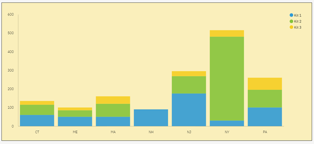
It’s easy to see that the total amount of units sold in NY is very large when compared to the total amount of units in ME. But what if we wanted to also visualize how much larger the total of NY is compared to the other columns? This is where a Mekko chart can help. 

Here is the same set of data via a Mekko chart:

IBM Planning Analytics Tips & Tricks: Mekko Chart

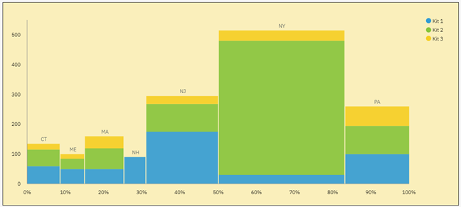
The Mekko chart still shows the breakdown of units by kit and it still shows the values for each column, but it adds a new metric by expanding the width of each column proportional to the overall percentage. In essence, this report is merging the concepts of a stacked column chart with the concepts of a pie chart.

IBM Planning Analytics, which TM1 is the engine for, is full of new features and functionality. Not sure where to start? Our team here at Revelwood can help. Contact us for more information at info@revelwood.com. And stay tuned for more Planning Analytics Tips & Tricks weekly in our Knowledge Center and in upcoming newsletters!

Home » PAW visualization

Filed Under: IBM Planning Analytics Tips & Tricks Tagged With: enterprise planning, IBM Cognos TM1, IBM Planning Analytics, IBM Planning Analytics Workspace, marimekko chart, mekko chart, mekko chart + paw, PAW visualization

Footer

Revelwood Overview

Revelwood helps finance organizations close, consolidate, plan, monitor and analyze business performance. As experts in solutions for the Office of Finance, we partner with best-in-breed software companies by applying best practices guidance and our pre-configured applications to help businesses achieve their full potential.

EXPERTISE

  • Workday Adaptive Planning
  • IBM Planning Analytics
  • BlackLine

ABOUT

  • Who We Are
  • What We Do
  • How We Help
  • How We Think
  • Privacy

CONNECT

Contact:

25B Vreeland Road, Suite 111 Florham Park, NJ 07932
201.984.3030
info@revelwood.com

Copyright © 2023 · Revelwood Inc. All rights reserved. Revelwood® and the Revelwood logo are registered marks of Revelwood Inc.