Do you sometimes find yourself repeatedly changing your IBM Planning Analytics Workspace (PAW) settings within the view screen, the dimension editor screen, or other areas of PAW? Did you know that you can define your own defaults for many of these settings?
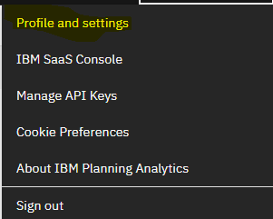
If you click your name at the top, right corner of the PAW screen, you will see a context menu. Click on “Profile and settings.”
From the left side menu pane, click on “Settings.”
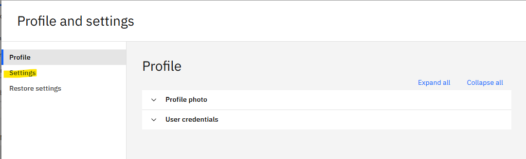
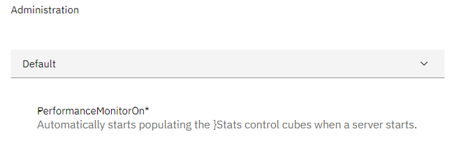
A list of options will be presented. In the example below, we are selecting the Dimension editor screen and choosing to show attribute types each time the attributes are viewed.
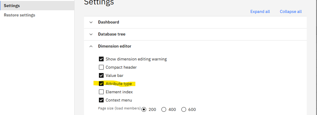
Once enabled, an image will appear next to an attribute name every time you are in the dimension editor’s attributes tab.

Revelwood is an IBM Gold Business Partner with 25+ years of experience designing, developing, implementing and maintaining IBM Planning Analytics environments. Revelwood has helped clients in all sizes across all industries optimize and grow their use of Planning Analytics. Revelwood’s Planning Analytics team consists of experienced PA experts, including a multi-year IBM Champion.
Stay up to date with PA – sign up for our weekly Planning Analytics Tips & Tricks newsletter, subscribe to our YouTube channel, and join our IBM Planning Analytics All-Stars group on LinkedIn.
Read more IBM Planning Analytics Tips & Tricks:
IBM Planning Analytics Tips & Tricks: PAW Attributes Types
IBM Planning Analytics Tips & Tricks: PAW Rule Auto Complete Display
IBM Planning Analytics Tips & Tricks: PAW Settings – File Upload Action Button