• Skip to main content
  • Skip to footer
Revelwood Logo

Revelwood

Your SUPER-powered WP Engine Site

  • Who We Are
    • About Us
      • Our Company
      • Our Team
      • Partners
    • Careers
      • Join Our Team
  • What We Do
    • Solutions
      • Workday Adaptive Planning
      • IBM Planning Analytics
      • BlackLine
    • Services
      • Implementation Services
      • Customer Care
        • Help Desk
        • System Administration as a Service
      • Training
        • Adaptive Planning Training
        • IBM Planning Analytics / TM1 Training
    • Products
      • DataMaestro
      • LightSpeed
      • IBM Planning Analytics Utilities
  • How We Help
    • Workday Adaptive Planning Use Cases
    • IBM Planning Analytics Use Cases
    • BlackLine Use Cases
    • Client Success Stories
  • How We Think
    • Knowledge Center
    • Events
    • News
  • Contact Us

enterprise planning

IBM Planning Analytics Tips & Tricks: Creating Control Objects from the Modeling Workbench

August 30, 2022 by Dillon Rossman

Did you know you can now create control objects in IBM Planning Analytics Workspace (PAW) with update 76? This includes control cubes, control dimensions, and control processes. Previously, creating your own control objects required a TurboIntegrator (TI) process. Now it can be done with a click of a button in PAW.

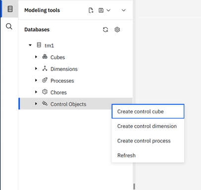
To create a control object, first open a modeling workbench. Once you are in the workbench, right click on “Control Objects” on the left pane. You will see options to create the various types of control objects.
IBM Planning Analytics Tips & Tricks: Creating Control Objects from the Modeling Workbench

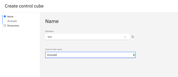
This will launch a wizard that prompts you to name your control object. If you select a control cube it will also prompt you to select dimensions for the cube.
IBM Planning Analytics Tips & Tricks: Creating Control Objects from the Modeling Workbench

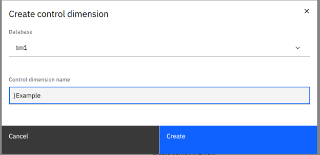
Control dimensions and processes will only ask for name.
IBM Planning Analytics Tips & Tricks: Creating Control Objects from the Modeling Workbench

Once you hit “Create” you will have a new control object without having to use a TI process.

Revelwood has worked with IBM Planning Analytics / TM1 for more than 27 years. We’ve partnered with hundreds of companies on the design, development, maintenance and updates of IBM Planning Analytics applications, across every industry. Have a challenge with Planning Analytics / TM1? We can help you!

Read more IBM Planning Analytics Tips & Tricks:

IBM Planning Analytics Tips & Tricks: Updating ODBC Connections for Multiple Processes

IBM Planning Analytics Tips & Tricks: PAx Control Objects

IBM Planning Analytics Tips & Tricks: Customizing Background Colors for Data and Header Cells

Home » enterprise planning

Filed Under: IBM Planning Analytics Tips & Tricks Tagged With: enterprise planning, Financial Performance Management, Planning Analytics + control object, Planning Analytics + modeling workbench, TM1, TM1 Tips & Tricks

IBM Planning Analytics Tips & Tricks: Mekko Chart

September 21, 2021 by Lee Lazarow Leave a Comment

Tips & Tricks

IBM Planning Analytics Workspace (PAW) offers many visualization options to allow you to show and analyze your data in creative ways. This includes standard chart types such as bar, line and pie. But it also includes some reports that are not always understood. One of these report types is a Mekko chart. 

A Mekko chart (also sometimes called a Marimekko chart) is used to extend a stacked column chart by using the width of each column to show the overall importance of that section.

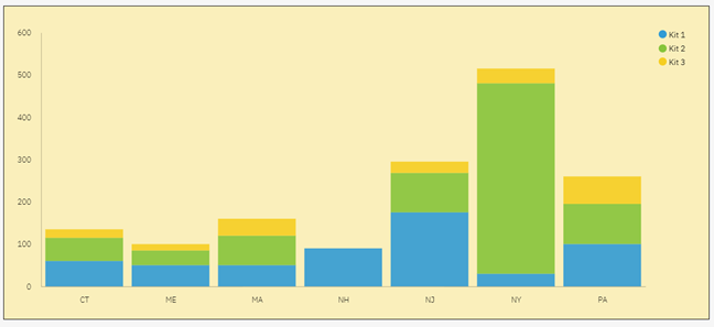
The following stacked bar chart shows Units by State by Item:

IBM Planning Analytics Tips & Tricks: Mekko Chart

It’s easy to see that the total amount of units sold in NY is very large when compared to the total amount of units in ME. But what if we wanted to also visualize how much larger the total of NY is compared to the other columns? This is where a Mekko chart can help. 

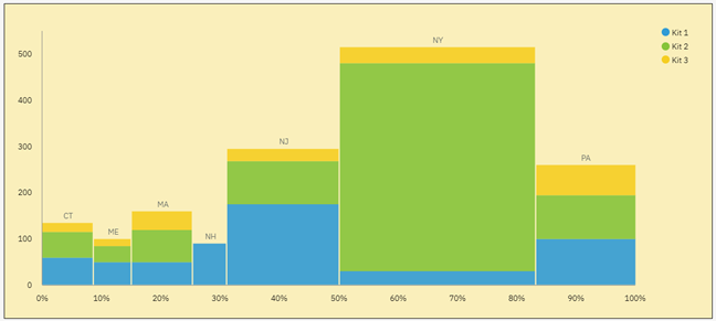
Here is the same set of data via a Mekko chart:

IBM Planning Analytics Tips & Tricks: Mekko Chart

The Mekko chart still shows the breakdown of units by kit and it still shows the values for each column, but it adds a new metric by expanding the width of each column proportional to the overall percentage. In essence, this report is merging the concepts of a stacked column chart with the concepts of a pie chart.

IBM Planning Analytics, which TM1 is the engine for, is full of new features and functionality. Not sure where to start? Our team here at Revelwood can help. Contact us for more information at info@revelwood.com. And stay tuned for more Planning Analytics Tips & Tricks weekly in our Knowledge Center and in upcoming newsletters!

Home » enterprise planning

Filed Under: IBM Planning Analytics Tips & Tricks Tagged With: enterprise planning, IBM Cognos TM1, IBM Planning Analytics, IBM Planning Analytics Workspace, marimekko chart, mekko chart, mekko chart + paw, PAW visualization

IBM Planning Analytics Tips & Tricks: PAW Lines vs Area for Multiple Elements

August 10, 2021 by Lee Lazarow Leave a Comment

Tips & Tricks

A line chart is typically used to show values over time. This type of chart is great to see trends with your data. An area chart is also used to show values over time and is sometimes referenced as a line chart with the area below the line filled. While this is the case in IBM Planning Analytics Workspace (PAW) for a chart that contains a single line, it is not the case for a chart with multiple lines.

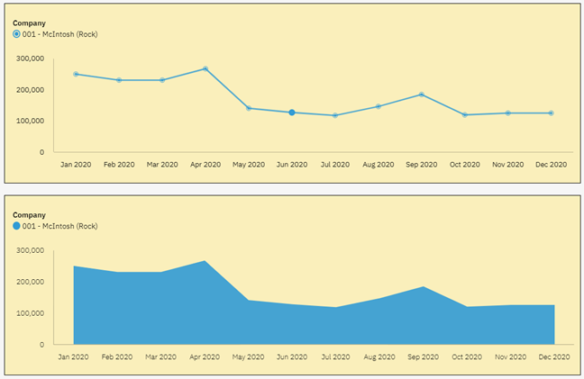
Here is a simple line chart in PAW and the related area chart:

IBM Planning Analytics Tips & Tricks: PAW Line vs Area for Multiple Elements

In both situations, you can see the trend and you can also see the values.

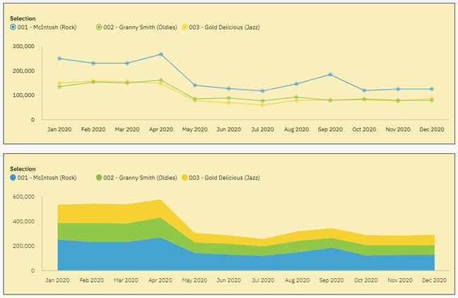
Here are the same PAW charts with multiple lines (e.g., multiple companies):

IBM Planning Analytics Tips & Tricks: PAW Line vs Area for Multiple Elements

In both situations you can again see the trends in the data by looking at the flows from left to right. However, you do not see the same values in the two reports. You can see this by looking at the labels on the Y-axis. The line chart is designed to show a set of independent values and therefore allows you to see the values for each company. The area chart is designed to show the accumulation of the values, which makes it hard to determine values for anything except for the bottom element.

As you can see, the type of chart makes a difference when reviewing your data. So how do you decide which chart to use? The simple answer is to ask yourself what you are looking to see. Are you looking for separate values or accumulated values? As long as your picture answers that question, you can never go wrong!

IBM Planning Analytics, powered by TM1, is full of new features and functionality. Need advice? Our team here at Revelwood can help. Contact us for more information at info@revelwood.com. We post new Planning Analytics Tips & Tricks weekly in our Knowledge Center and in newsletters.

Read more IBM Planning Analytics Tips & Tricks:

IBM Planning Analytics Tips & Tricks: Scatter Charts vs Bubble Charts

IBM Planning Analytics Tips & Tricks: The Waterfall Chart

IBM Planning Analytics Tips & Tricks: PAW Chart Padding

Home » enterprise planning

Filed Under: IBM Planning Analytics Tips & Tricks Tagged With: charts, enterprise performance management, enterprise planning, Financial Performance Management, IBM Planning Analytics, IBM Planning Analytics Workspace, IBM Planning Analytics Workspace charts

FP&A Done Right: Overcoming Obstacles to Collaboration in the Office of Finance

August 6, 2021 by Revelwood Leave a Comment

This is a guest blog post from our partner Workday Adaptive Planning, highlighting how to better improve collaboration in the Office of Finance.

As the role of CFO continues to become more strategic and collaborative, CFOs are expecting their teams to follow suit. As such, many finance leaders are requiring their teams to broaden their understanding of other functions and pushing them to communicate and collaborate more effectively, both internally and externally. According to our studies, collaborative work now consumes a significant portion of the finance team’s week.

The limitations of legacy tech

One of the primary obstacles to better collaboration is outdated technology. With many finance departments still relying on email and spreadsheets to drive their reporting process, collaboration is a time-consuming, frustrating task.

Think about this common scenario: A report identifies a variance and is emailed out to multiple stakeholders for review. This triggers a massive email chain of variance queries, change requests, and edits. Soon you have multiple versions of the spreadsheet existing on different computers. Which one is the right one? And if it’s not saved on the server, who can access it?

Of course, the other issue is accuracy. How does anyone know whether the numbers in the spreadsheet are correct in the first place? Manual-driven processes are susceptible to errors like entering data in the wrong cell, messing up a formula, or adding an extra digit by mistake. As stakeholders copy and paste information into spreadsheets and email them along, you lose the ability to easily track who is entering data or verify where that data originally came from.

The role of nonfinance managers in financial reporting

When some finance departments talk about collaboration, they think about ways of making it easier to collaborate within the department. While that’s important, true collaboration means making it just as easy for nonfinance managers to be able to access and make changes to a report.

Going back to spreadsheets, often the finance department works to get the report perfect before sending it off to an operational manager for review. If the operational manager adds a last-minute update, it can require a massive amount of work to incorporate, review, and verify.

While accurate data is obviously the top priority, something else to consider when collaborating with nonfinance managers is data visualization. Even after you have all the numbers together in a report, a spreadsheet can be difficult to interpret and understand. A report is only as good as the action your team can take from it; to improve collaboration, you must improve both access and understanding of the data.

The 3 steps to making reporting collaborative

If you wish to make your reporting a more collaborative process, here are three keys to keep in mind:

Step 1. Access
Instead of static spreadsheets and email, it’s critical to move your reporting process to the cloud using smart financial reporting software like Workday Adaptive Planning. Because it’s accessible through the web, all your stakeholders can work from the same set of numbers at the same time without confusion or delay. And since you can control and track at the user level who has access and who enters data, you can greatly increase transparency and accountability throughout the reporting process.

Step 2. Ownership
In addition, Workday Adaptive Planning can automatically import data from both your financial and nonfinancial systems. This not only saves time and reduces errors, but it also takes all your data out of departmental silos and brings it together to give your entire company a single source of truth to work from.

Step 3. Understanding
Once you’ve automated data collection, you can focus on delivering insights. Workday Adaptive Planning lets you easily distribute board reports, slice and dice management and financial reports for specific departments, and drill down into the details. Because it’s connected to all your systems, you can also easily create real-time, visually appealing dashboards that give nonfinancial managers instant insight into their department’s performance.

Collaboration is integral to today’s finance initiatives

The marriage of traditional accounting and analytic skills with interpersonal communication and collaboration skills reflects the changing face of today’s finance team and leaders. Data alone is not valuable to today’s organizations. But the ability to aggregate, align, and interpret company-wide data that guides corporate performance continues to separate the traditional from the modern CFO.

This blog post was originally published on the Workday Adaptive Planning blog.

Home » enterprise planning

Filed Under: FP&A Done Right Tagged With: collaboration + finance, enterprise performance management, enterprise planning, Financial Performance Management, FP&A, FP&A done right, Office of Finance

IBM Planning Analytics Tips & Tricks: Depreciation

July 27, 2021 by Lee Lazarow Leave a Comment

P&L planning models consist of a variety of inputs, including revenue planning and various forms of expense planning.  In addition to these standards, we are often asked to develop other planning components. One of these components entails a depreciation process, which leads to the question: what is depreciation?

Depreciation is defined as “a reduction in the value of an asset due to wear and tear or obsolescence.” In business terms, this typically entails a calculation to determine your current asset’s value. 

There are various methods to calculate depreciation, all of which are taught in an Accounting 101 class. Most organizations, however, use a simple approach called “straight line” that spreads the reduction evenly over the course of a pre-defined asset life.

There are typically four components to a depreciation process:

  • Asset value – the original cost of the asset
  • Asset life – how long will it take for the asset to stop reducing its value
  • Salvage value – the amount you expect the asset to be worth at the end of the asset’s life (e.g., a resale value)
  • In service date – the time that you begin depreciating the asset, which is not always the same time as the purchase date

The calculation is relatively simple: subtract the salvage value from the asset value to determine the amount to be depreciated, then divide that amount by the asset life. Remember to ensure that the asset life uses the same level of time periods as your model … months, quarters, or years.

Once the depreciation calculation is performed you can easily view the original asset amount, the total allocated amount, and the current asset value. Want to learn more about depreciation details or recommended best practices? Contact us and we’ll help you.

IBM Planning Analytics, powered by TM1, is full of new features and functionality. Need advice? Our team here at Revelwood can help. Contact us for more information at info@revelwood.com. We post new Planning Analytics Tips & Tricks weekly in our Knowledge Center and in newsletters.

Read more IBM Planning Analytics Tips & Tricks:

IBM Planning Analytics Tips & Tricks: Scatter Chart vs Bubble Chart

IBM Planning Analytics Tips & Tricks: The Waterfall Chart

IBM Planning Analytics Tips & Tricks: 445

Home » enterprise planning

Filed Under: IBM Planning Analytics Tips & Tricks Tagged With: Cognos TM1, depreciation, enterprise performance management, enterprise planning, Financial Performance Management, FP&A, IBM Planning Analytics, TM1

FP&A Done Right: 3 Ways to Improve Collaboration with Colleagues Outside of Finance

July 23, 2021 by Revelwood Leave a Comment

This is a guest blog post from our partner Workday Adaptive Planning, explaining how to improve collaboration between the Office of Finance and business managers.

Many companies suffer from poor communication and collaboration between financial and nonfinancial managers. Operating managers don’t have sufficient input or buy-in to the financial planning process, and they aren’t educated about how their decisions can influence overall profitability. For its part, finance isn’t able to offer real performance insights that might truly help managers improve their results.

Instead of working closely together to plan and forecast, finance and business resort to negotiations that can involve high levels of conflict. Why is this, and how can it be changed to strengthen collaboration between finance and the business—and therefore transform FP&A?

Drowning in metrics, measurements, and spreadsheets

First of all, companies sometimes flood managers with measurements and metrics, too few of which effectively help managers understand and improve their performance. Too much measuring can add cost and complexity to an organization.

Secondly, spreadsheets continue to dominate planning processes in most companies. While spreadsheets work well for individual productivity, they cause problems when it comes to sharing and aggregating. Finance gets bogged down in low-value-added work—such as formatting and troubleshooting spreadsheets—and can’t provide useful service to business managers.

Meanwhile, business managers waste time managing to budgets instead of managing their business. They often don’t get the information they need, when they need it, from finance. Instead, they’re deluged with data, metrics, and reports, much of which provides little value.

Furthermore, many planning systems are designed and implemented by finance and are seen as irrelevant by business managers. The result is lack of buy-in and enthusiasm.

Clearing the decks for useful analysis and true collaboration

Finance can make room for higher-value work for both themselves and managers by leading the way to less detail and complexity, simplifying internal systems, and reducing the amount of time managers spend producing counterproductive reports and analyzing too many measurements.

In so doing, finance can provide effective decision support and performance insight that can truly help managers improve their results, making finance a real partner rather than an adversary. Here are three best practices that will help you make these changes.

1. Continuous planning

First, replace detailed annual planning cycles, which take too long and result in a budget that is already out of date as soon as it is complete. A more effective planning system is a continuous process, focused on rolling views that look 12 to 18 months ahead. These continuous plans should enable managers to respond more rapidly to emerging events and trends and to changing business environments.

Replacing the annual budget with a rolling forecast can save huge amounts of work, freeing all managers to spend more time on value-added work. It will also improve the relationship between finance and business managers, as finance will have more time to provide better service.

2. Move from monthly variance reporting to KPIs and dashboards

Most companies manage through annual budgets and use monthly variance reporting as the primary feedback mechanism for managers. But monthly variance reporting is too slow and fails to reveal underlying causes of problems.

What is more effective is fast feedback of financial results, summarized and shown as trends and moving averages. KPIs should act as a management dashboard. They should provide managers with early warning signs when problems are brewing and action needs to be taken.

Defining measurements is just the first step. “The next step, and perhaps the hardest part, is to set in motion a cadence for the management team to know and really understand performance through KPIs so that they can use that knowledge to make the right decisions.

These KPIs should be few in number and appropriate to the level of management. A small number of key metrics should be reported daily and weekly. KPIs should provide a fast, high-level view of what is happening today and what is likely to happen in the short-term future. Moving to KPIs in this fashion will not only provide true value to managers but will also lighten the reporting load for the entire organization.

3. Deploy cloud technology that provides fast, relevant information, enabling collaboration

Finance can use technology to provide a performance management system that delivers what managers need—fast, relevant information. Avoid investing in complex IT systems that consume valuable time and money without providing reasonable value.

Instead, implement a dedicated system that employs cloud-based technology to enable unlimited numbers of managers to work together on driver-based forecasts, which are automatically aggregated at every level. This system should also have tight integration with data from other enterprise systems, so that it serves as the primary performance management system.

Why wait?

By implementing these three best practices, your finance team can transform itself and your company’s performance management practices. Your finance team can move beyond simply being effective at financial management and scorekeeping, and instead become a trusted and integral member of the strategic management team. And finance can offer real performance insights that can truly help your managers improve their results.

This blog post was originally published on the Workday Adaptive Planning blog.

Home » enterprise planning

Filed Under: FP&A Done Right Tagged With: enterprise performance management, enterprise planning, Financial Performance Management, FP&A done right, Office of Finance, Rolling Forecasts, xP&A

IBM Planning Analytics Tips & Tricks: Scatter Chart vs Bubble Chart

July 20, 2021 by Lee Lazarow Leave a Comment

Tips & Tricks

A scatter chart is used to show relationships within your data. This type of chart is great to see patterns and groupings over a large set of values. A bubble chart is also used to show relationships and it also great to see patterns. So what is the difference between the two types of charts?

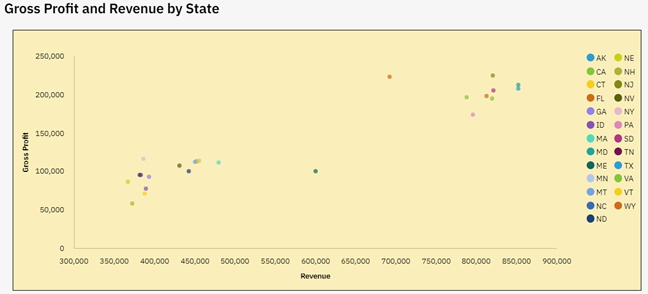
A scatter chart is used to show the correlation of two data sets that have different ranges of values. The IBM Planning Analytics Workspace (PAW) example below shows the correlation of revenue and gross profit.

IBM Planning Analytics Tips & Tricks: Scatter vs Bubble

The values associated with gross profit range from approx. 50,000 to 250,000. The values associated with revenue range from approx. 350,000 to 850,000. The scatter chart allows you to put these two different data sets onto the same chart and therefore see patterns. In this case, we see a positive correlation between larger revenue and larger profit … thereby telling us that our indirect costs are somewhat symmetrical to our direct costs.

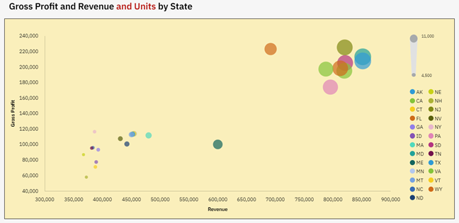
But what if we also want to know how the number of units impacts these numbers? This cannot be done on a simple two dimensional chart, but it can be done by adjusting the size of the dots within the chart. This adjustment approach is the purpose of a PAW bubble chart.

Here is the same set of data with the inclusion of units:

IBM Planning Analytics Tips & Tricks: Scatter vs Bubble

In both situations you can see the correlation in the data by looking at the patterns.  However, the bubble chart also gives you information on the units by adjusting the size of the dots.  This gives us another positive correlation between larger unit sales and larger revenue … thereby telling us that we may have the opportunity to introduce regional pricing.

As you can see, the type of chart makes a difference when reviewing your data. So how do you decide which chart to use? The simple answer is to ask yourself how many details do you want to see at once? Are you looking for two correlations or more? As long as your picture answers that question, you can never go wrong!

IBM Planning Analytics, powered by TM1, is full of new features and functionality. Need advice? Our team here at Revelwood can help. Contact us for more information at info@revelwood.com. We post new Planning Analytics Tips & Tricks weekly in our Knowledge Center and in newsletters.

Read more IBM Planning Analytics Tips & Tricks:

IBM Planning Analytics Tips & Tricks: Pie Chart Sizing

IBM Planning Analytics Tips & Tricks: The Waterfall Chart

IBM Planning Analytics Tips & Tricks: PAW Chart Padding

Home » enterprise planning

Filed Under: IBM Planning Analytics Tips & Tricks Tagged With: enterprise performance management, enterprise planning, Financial Performance Management, IBM Cognos TM1, IBM PAW, IBM Planning Analytics, IBM Planning Analytics Workspace, scatter chart vs bubble chart, TM1

IBM Planning Analytics Tips & Tricks: Planning Analytics Workspace (PAW) Marker Shape

July 13, 2021 by Lee Lazarow Leave a Comment

A line chart can either be a simple line or it can include markers for each data point. Most people associate a marker as a simple dot, but did you know that IBM Planning Analytics Workspace (PAW) allows you to configure the shape of the markers?

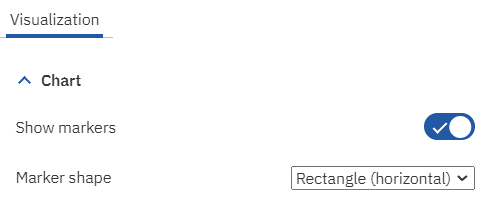
This is done by enabling the property called “Show markers’ and then defining a value for the property called “Marker Shape.” Both of these settings are found within the Chart settings of the Visualization area.

IBM Planning Analytics Workspace Marker Space

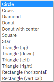
In addition to a circle, PAW offers a variety of shapes that you can use on your chart.

IBM Planning Analytics Workspace Marker Shape

This flexibility allows you to customize your line charts and enhance your end user experience.

IBM Planning Analytics, powered by TM1, is full of new features and functionality. Need advice? Our team here at Revelwood can help. Contact us for more information at info@revelwood.com. We post new Planning Analytics Tips & Tricks weekly in our Knowledge Center and in newsletters.

Read more IBM Planning Analytics Tips & Tricks:

IBM Planning Analytics Tips & Tricks: PAW Chart Padding

IBM Planning Analytics Tips & Tricks: Planning Analytics Workspace Tab Icons

IBM Planning Analytics Tips & Tricks: Planning Analytics Workspace Tab Colors

Home » enterprise planning

Filed Under: IBM Planning Analytics Tips & Tricks Tagged With: enterprise performance management, enterprise planning, Financial Performance Management, IBM PAW, IBM PAW marker, IBM Planning Analytics, IBM Planning Analytics Workspace, IBM Planning Analytics Workspace marker

FP&A Done Right: 3 Strategic Skills for FP&A Leaders

July 9, 2021 by Revelwood Leave a Comment

This is a guest blog post from our partner Workday Adaptive Planning, recommending strategic skills for FP&A leaders.

You stay late to meet your deadlines. You triple-check your reports to keep them error-free. You turn around one-off requests at the drop of a dime.

But you still haven’t gotten that big promotion.

That may mean there’s a disconnect between the work you’re doing and the work your boss would like you to do. Research from Robert Half Management Resources has found that finance leaders want FP&A professionals who can look beyond the bottom line to see the big picture. A study found that 86% of CFOs said strategic thinking abilities are important for accounting and finance professionals, with 30% of those reporting that these skills are now mandatory.

And this demand is only expected to increase. In one popular Workday Adaptive Planning survey, CFOs predicted that the time spent by the FP&A team on strategic tasks will double—to as much as 50%.

To show that you’re ready to take on more strategic responsibilities, start by demonstrating that you can make smart decisions. Developing these three skills will help you highlight your potential—and get picked for the next promotion.

1. Study Every Angle

Strategic thinkers plan by identifying several potential paths forward and weighing their likely outcomes against each other. And according to another survey of ours, 48% of CFOs said that, during a market contraction, finance teams provide the most strategic value by planning for multiple scenarios.

That means FP&A professionals who can identify, model and analyze how different factors could impact the company are more likely to stand out as problem solvers. The right software can help you quickly create projections based on potential risks and opportunities on the horizon—and identify actions that could help your company meet its strategic goals. This type of proactive planning can give you the ammo you need to make well-informed recommendations when it’s time for your boss to make the next big decision.

2. Create Compelling Visuals

When making a presentation to your CFO or board, don’t make your numbers do all the talking. Data is an integral part of the conversation, but it doesn’t tell the whole story. Leaders need you to explain what metrics really mean.

Data visualization can help you cut through the clutter and deliver comprehensive, easy-to-digest analysis. And this is exactly the kind of presentation executive teams crave. According to published reports, 31% of CFOs indicated that improving visualization skills would help FP&A teams represent data more effectively.

Learning how to create visuals that explain variances, period-over-period performance and sales projections will help you deliver the wow factor that will put you in the leadership pipeline.

3. Build Bridges

Sometimes, sitting down with people from other departments is all you need to gain a fresh perspective or uncover a new approach to a common problem. And this type of collaboration is what execs are looking for from their finance team.

According to an off-cited EY report, when CFOs were asked about their top goals for the finance function over the next five years, 95% listed improving business partnering with other units as either critical (58%) or a significant priority (37%)—making it by far the most popular priority.

But collaboration doesn’t have to happen around a table, looking atspreadsheets and a whiteboard. If the company’s data exists in a centralized repository, collaboration can happen virtually. Different teams can drag and drop figures into sharable reports that others can comment on in real time, making it easier to get leaders the fast feedback they need to make more informed decisions.

FP&A needs to put itself in the business leaders’ shoes. Anticipate their needs, and creatively look for ways to add value by providing insights and unique perspectives, improving the efficiency of key activities and introducing frameworks, models and structure to enable these business leaders to better plan, manage and run their operational areas.

Grow next-gen FP&A skills

Modern finance teams are more than number crunchers; they’re key partners in support of a company’s strategic vision. But not every new hire (or, frankly, finance team member) is going to have strong strategic acumen from the start. That’s OK, as long as CFOs and finance leaders are willing to nurture those skills with hands-on coaching.

It’s one thing to hire someone and then give them a list of functions they’re responsible for. It’s another to really check in on them, give them guidance, help them avoid certain potholes, and really help them bridge any gaps. Starting early with leadership training, having team members give presentations to strengthen their communication skills, and emphasizing one-on-one coaching sessions over classroom trainings can all be effective ways to build up skills that stretch beyond classic FP&A duties.

Above we presented the top 3 skills that will help you highlight your potential. In closing, we present the top 8 skills needed in FP&A teams, according to a leading publication for finance professionals:

1. Strategic and critical thinking

Automation technology frees you from the manual work and allows you to have more time to think about data critically and strategically.

2. Communication

To be successful, an FP&A professional needs to ask questions, listen objectively to various viewpoints, consider the information at their disposal, and respond appropriately to various stakeholders across multiple communication channels.

3. Tech Savvy Data analytics

New technologies can benefit your organization in various ways. To recognize them, you need to develop an enthusiasm for new technological advances and intellectual curiosity about what’s coming next. Being a tech savvy finance professional gives you a competitive advantage.

4. Technical accounting and finance skills

Undoubtedly, FP&A professionals must be skilled in their areas of expertise. You need to continue working on your education by learning new aspects of the professional.

5. Innovation

Automation will require finance professionals to be innovative and creative when it comes to solving business problems. This is one of the ways to contribute value to your organization.

6. Anticipating and serving evolving needs

Modern FP&A is not only about mastering skills in data analysis. You will need to recognize emerging requirements around you.

7. Leadership

Finance does not work exclusively with numbers. If you have emotional and cross-cultural intelligence and empathy, it will be easier for you to understand the needs of those around you. There comes a time when finance must be the reassuring voice and visionary.

8. Collaboration

Cross-functional collaboration is playing a major part in the overall success of your organization. FP&A professionals need to learn how to work with colleagues who have other skills. Their expertise and specialties can help finance develop the big-picture ideas. It is also important to keep working on your virtual collaboration and management skills.

This blog post was originally published on the Workday Adaptive Planning blog.

Home » enterprise planning

Filed Under: FP&A Done Right Tagged With: enterprise planning, FP&A, FP&A done right, FP&A leadership, FP&A skills, modern finance

  • Go to page 1
  • Go to page 2
  • Go to Next Page »

Footer

Revelwood Overview

Revelwood helps finance organizations close, consolidate, plan, monitor and analyze business performance. As experts in solutions for the Office of Finance, we partner with best-in-breed software companies by applying best practices guidance and our pre-configured applications to help businesses achieve their full potential.

EXPERTISE

  • Workday Adaptive Planning
  • IBM Planning Analytics
  • BlackLine

ABOUT

  • Who We Are
  • What We Do
  • How We Help
  • How We Think
  • Privacy

CONNECT

Contact:

25B Vreeland Road, Suite 111 Florham Park, NJ 07932
201.984.3030
info@revelwood.com

Copyright © 2023 · Revelwood Inc. All rights reserved. Revelwood® and the Revelwood logo are registered marks of Revelwood Inc.