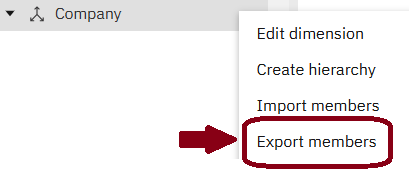
• Skip to main content
  • Skip to footer
Revelwood Logo

Revelwood

Your SUPER-powered WP Engine Site

  • Who We Are
    • About Us
      • Our Company
      • Our Team
      • Partners
    • Careers
      • Join Our Team
  • What We Do
    • Solutions
      • Workday Adaptive Planning
      • IBM Planning Analytics
      • BlackLine
    • Services
      • Implementation Services
      • Customer Care
        • Help Desk
        • System Administration as a Service
      • Training
        • Adaptive Planning Training
        • IBM Planning Analytics / TM1 Training
    • Products
      • DataMaestro
      • LightSpeed
      • IBM Planning Analytics Utilities
  • How We Help
    • Workday Adaptive Planning Use Cases
    • IBM Planning Analytics Use Cases
    • BlackLine Use Cases
    • Client Success Stories
  • How We Think
    • Knowledge Center
    • Events
    • News
  • Contact Us

IBM Planning Analytics Tips & Tricks

IBM Planning Analytics Tips & Tricks: Charts in Planning Analytics Workspace, Part 2

January 31, 2023 by Revelwood

Did you know IBM Planning Analytics Workspace (PAW) gives you many options for showing data in charts? We recently shared a few tips and tricks for visualizing your data in charts. Here are some more.

Pie Chart Sizing

Did you know that PAW allows you to “split” your pie chart widget to define how much of the space is allocated to the legend and how much of the space is allocated to the chart? 

In this blog post, we explain how to view and modify the split. 

PAW Chart Multicolors

One of the visualizations in Planning Analytics is a column chart. This type of chart is a good way to compare items since all the lines are in proportion to each other.

Read this blog post to learn an easy way to create a column chart via an exploration. We then explain how to change that visualization into a column chart. 

Mekko Charts

PAW offers many visualization options to allow you to show and analyze your data in creative ways. This includes standard chart types such as bar, line and pie. But it also includes some reports that are not always understood. One of these report types is a Mekko chart.

A Mekko chart (also sometimes called a Marimekko chart) is used to extend a stacked column chart by using the width of each column to show the overall importance of that section. Read our blog post on using Mekko charts. 

IBM Planning Analytics, which TM1 is the engine for, is full of new features and functionality. Not sure where to start? Our team here at Revelwood can help. Contact us for more information at info@revelwood.com. And stay tuned for more Planning Analytics Tips & Tricks weekly in our Knowledge Center and in upcoming newsletters!

Read more IBM Planning Analytics Tips & Tricks:

IBM Planning Analytics Tips & Tricks: Charts in Planning Analytics Workspace, Part 1

IBM Planning Analytics Tips & Tricks: DefineCalc

IBM Planning Analytics Tips & Tricks: Top 3 Blog Posts of 2022

Home » IBM Planning Analytics Tips & Tricks

Filed Under: IBM Planning Analytics Tips & Tricks Tagged With: Financial Performance Management, IBM Cognos TM1, IBM Planning Analytics, IBM Planning Analytics Tips & Tricks, Planning & Reporting, TM1

IBM Planning Analytics Tips & Tricks: How to Make an MDX Statement Dynamic

January 24, 2023 by Revelwood

Did you know we have a number of resources available to learn more about MDX? We hosted a two-part series on How to Use MDX in Your IBM Planning Analytics Series. We also published a blog post, IBM Planning Analytics Tips & Tricks: MDX Syntax Explained, to accompany part 1 of the webinar series. 

In part 2 of our MDX webinar series, we demonstrate how to make an MDX dynamic by using the power of Excel.

You’ll see we start with a basic Excel report, generated out of IBM Planning Analytics for Excel (PAx). We then take the static, base MDX and turn it into a concatenation of parts of the index statement and the cell reference. In turn, that enables us to change the root account, thereby changing the data that shows in the report.

Watch the full webinar to learn more about working with MDX.

Revelwood has worked with IBM Planning Analytics / TM1 for more than 27 years. We’ve partnered with hundreds of companies on the design, development, maintenance and updates of IBM Planning Analytics applications, across every industry. Have a challenge with Planning Analytics / TM1? We can help you!

Read more IBM Planning Analytics Tips & Tricks on MDX:

IBM Planning Analytics Tips & Tricks: An Approach to Strengthening your MDX Skills

IBM Planning Analytics Tips & Tricks: Using MDX to Compare Dimension Hierarchies

IBM Planning Analytics Tips & Tricks: Making Default Cube Views Dynamic with MDX

Home » IBM Planning Analytics Tips & Tricks

Filed Under: IBM Planning Analytics Tips & Tricks Tagged With: Financial Performance Management, IBM Planning Analytics, IBM Planning Analytics Tips & Tricks, Planning & Forecasting, TM1

IBM Planning Analytics Tips & Tricks: Charts in Planning Analytics Workspace, Part 1

January 10, 2023 by Revelwood

Did you know IBM Planning Analytics Workspace (PAW) gives you many options for showing data in charts? Here are some tips and tricks for working with charts in PAW.

Scatter Chart vs Bubble Chart

A scatter chart is used to show relationships within your data. This type of chart is great to see patterns and groupings over a large set of values. A bubble chart is also used to show relationships and it is also great to see patterns. So what is the difference between the two types of charts? 

In this blog post, we explain the difference between the two types of charts. As you’ll learn, the type of chart makes a difference when reviewing your data. How to decide which chart to use? It’s simple – ask yourself how many details you want to see at once. 

The Waterfall Chart

PAW includes various visualizations that can be used to view your data. One of these visualizations entails a chart called a waterfall chart. This type of chart will help you show the components of a summarized number. It is very helpful in determining which values are beneficial to the total and which values are detrimental.

This blog post shows an exploration in PAW and its corresponding waterfall chart. 

Lines vs Area for Multiple Elements

A line chart is typically used to show values over time. This type of chart is great to see trends with your data. An area chart is also used to show values over time and is sometimes referenced as a line chart with the area below the line filled. While this is the case in PAW for a chart that contains a single line, it is not the case for a chart with multiple lines. 

Read this blog post to learn about a line chart versus an area chart. 

IBM Planning Analytics, which TM1 is the engine for, is full of new features and functionality. Not sure where to start? Our team here at Revelwood can help. Contact us for more information at info@revelwood.com. And stay tuned for more Planning Analytics Tips & Tricks weekly in our Knowledge Center and in upcoming newsletters!

Read more IBM Planning Analytics Tips & Tricks:

IBM Planning Analytics Tips & Tricks: DefineCalc

IBM Planning Analytics Tips & Tricks: Top 3 Blog Posts of 2022

IBM Planning Analytics Tips & Tricks: 2022’s Top 3 Tips & Tricks Videos

Home » IBM Planning Analytics Tips & Tricks

Filed Under: IBM Planning Analytics Tips & Tricks Tagged With: Financial Performance Management, IBM Cognos TM1, IBM Planning Analytics, IBM Planning Analytics Tips & Tricks, TM1

IBM Planning Analytics Tips & Tricks: Excel SEQUENCE

November 22, 2022 by Lee Lazarow

Have you ever needed to quickly generate a list of numbers? Maybe you need to create a list from 1-100. Maybe you want to create a list of the first 100 even numbers. Maybe you want to create those same lists in descending order. Did you know that Excel has a function called SEQUENCE which allows you to quickly create these lists?

The SEQUENCE function is used to generate an array of sequential numbers.  The syntax of the function is:

=SEQUENCE (rows, [columns], [start], [step])

  • Rows (required)
    • This is the number of rows to be filled
  • Columns (optional)
    • This is the number of columns to be filled
    • If skipped, this defaults to 1
  • Start (optional)
    • This is the starting number in the sequence
    • If skipped, this defaults to 1
  • Step (optional)
    • This is the increment for each subsequent value
    • If skipped, this defaults to 1
    • This can be negative to provide a descending list

The following example shows a single column list from 1-10

Chart

Description automatically generated with medium confidence

The same formula doubles the result when the column parameter is defined. Note that the results read from right to left (e.g., the entire row) and then goes down.

Table

Description automatically generated with medium confidence

Here is the same formula when adding both a starting value and an increment.

Table

Description automatically generated

Not only can this formula be used to quickly generate lists, but it can also be used as part of a combination:

  • With the DATE formula to define a calendar
  • With the TIME formula to create a daily schedule
  • With data from another column to create unique IDs for items like products or employees

Read more IBM Planning Analytics Tips & Tricks:

IBM Planning Analytics Tips & Tricks: Creating Control Objects from the Modeling Workbench

IBM Planning Analytics Tips & Tricks: Shortcuts in PAW Models

IBM Planning Analytics Tips & Tricks: Customizing Background Colors for Data and Header Cells

Home » IBM Planning Analytics Tips & Tricks

Filed Under: IBM Planning Analytics Tips & Tricks Tagged With: Financial Performance Management, IBM Cognos TM1, IBM Planning Analytics, IBM Planning Analytics Tips & Tricks, TM1

IBM Planning Analytics Tips & Tricks: PAW Go To Line in Process

November 15, 2022 by Lee Lazarow

Sometimes your TurboIntegrator scripts can become very long. While it’s nice to be able to scroll up and down throughout your code, there are times that you may want to go directly to a specific line. IBM Planning Analytics Workspace (PAW) version 79 allows this via the “Go to Line” button.

Once clicked, you are prompted to select a section and a line within the section.  

When defining a line, note that the line numbers restart within each section. In the example below, each set of generated statement lines begin at line 2 (since I like to skip a line for easy reading) and the first line of code in the Data section begins at line 5.

This approach will help you speed up your navigation as you write code in TurboIntegrator.

Revelwood has worked with IBM Planning Analytics / TM1 for more than 27 years. We’ve partnered with hundreds of companies on the design, development, maintenance and updates of IBM Planning Analytics applications, across every industry. Have a challenge with Planning Analytics / TM1? We can help you!

Read more IBM Planning Analytics Tips & Tricks:

IBM Planning Analytics Tips & Tricks: Planning Analytics Workspace Borders in Preview

IBM Planning Analytics Tips &Tricks: Rounded Buttons in Planning Analytics Workspace

IBM Planning Analytics Tips & Tricks: MDX Syntax Explained

Home » IBM Planning Analytics Tips & Tricks

Filed Under: IBM Planning Analytics Tips & Tricks Tagged With: Financial Performance Management, IBM Cognos TM1, IBM Planning Analytics, IBM Planning Analytics Tips & Tricks, TM1

IBM Planning Analytics Tips & Tricks: Planning Analytics Workspace Borders in Preview

November 1, 2022 by Lee Lazarow

Tips & Tricks

IBM Planning Analytics Workspace (PAW) allows you to easily create selector widgets that can be used for updating the data in your PAW book. This is done by adding a dimension as a selector widget.

You can edit the list of elements (e.g., the set) and the way the list appears. The selector widget allows you to easily select an element that is synchronized to your charts and explorations. When selecting the element, a border appears around the widget.

Diagram

Description automatically generated with low confidence

While this border offers features such as the ability to expand the screen, it clearly makes the list into a separate section of the page. You can remove the border by using the property called “Show selected border in preview” (within the area called General, Appearance). Here is the same list without the border enabled:

Text

Description automatically generated

This property will allow you to create the perception of a single page and not a set of independent objects.

Revelwood has worked with IBM Planning Analytics / TM1 for more than 27 years. We’ve partnered with hundreds of companies on the design, development, maintenance and updates of IBM Planning Analytics applications, across every industry. Have a challenge with Planning Analytics / TM1? We can help you!

Read more IBM Planning Analytics Tips & Tricks:

IBM Planning Analytics Tips &Tricks: Rounded Buttons in Planning Analytics Workspace

IBM Planning Analytics Tips & Tricks: MDX Syntax Explained

IBM Planning Analytics Tips & Tricks: Global Settings in Overview Area of Exploration

Home » IBM Planning Analytics Tips & Tricks

Filed Under: IBM Planning Analytics Tips & Tricks Tagged With: IBM Cognos TM1, IBM Planning Analytics, IBM Planning Analytics Tips & Tricks, Planning & Forecasting, TM1

IBM Planning Analytics Tips & Tricks: Global Settings in Overview Area of Exploration

October 11, 2022 by Revelwood

Do you know how to define your global settings in the overview area of an IBM Planning Analytics Exploration? Revelwood’s FP&A Technology Director, Lee Lazarow, demonstrates how to manage and define these settings. 

Watch our latest IBM Planning Analytics Tips & Tricks video to learn:

  • Locate the gear icon in the overview area of your Exploration
  • Identify the four different global settings you can define
    • Hierarchy name – shows details about each dimension
    • Iconography – gives details about each one of the dimensions, similar to the legacy version of Subset Editor
    • Context information – provides details about the database, which database it is references, which cube it is referencing
    • Section headers – shows within the area what is the context, or what was previously called titles or picks.

When you define your global settings in IBM Planning Analytics, you create a better experience for your end users. It enables end users to determine what they are looking at and what they are navigating through.

Revelwood has worked with IBM Planning Analytics / TM1 for more than 27 years. We’ve partnered with hundreds of companies on the design, development, maintenance and updates of IBM Planning Analytics applications, across every industry. Have a challenge with Planning Analytics / TM1? We can help you!

Watch more IBM Planning Analytics Tips & Tricks Videos:

IBM Planning Analytics Tips & Tricks: Add Color to Multidimensional PAW Charts

IBM Planning Analytics Tips & Tricks: Shortcuts in PAW Models

Home » IBM Planning Analytics Tips & Tricks

Filed Under: IBM Planning Analytics Tips & Tricks Tagged With: Financial Performance Management, IBM Cognos TM1, IBM Planning Analytics, IBM Planning Analytics Tips & Tricks, TM1

IBM Planning Analytics Tips & Tricks: Dynamic Subsets Based on a Cube

June 28, 2022 by Dillon Rossman Leave a Comment

Did you know you can use MDX to create dynamic subsets based on cube values in IBM Planning Analytics? In our example we will only show companies with net sales greater than 30,000,000 in the selected year. 

Graphical user interface, text, email

Description automatically generated

An MDX statement that can provide this result may look something like this:

{FILTER({TM1SUBSETALL([bpmCompany])},[bpmFinance].([bpmScenario].CurrentMember, [bpmDepartment].CurrentMember,[bpmAccount].[Net Sales],[bpmCurrency].CurrentMember,[bpmPeriod].CurrentMember,[bpmFinance_Msr].[Balance Post-Alloc]) > 30000000 )}

The components of this statement are:

  • FILTER({abc}),[Cube].([Dim1].[Value],[Dim2].[Value]…) > 30000000 )
    • Filter set ABC to only show members with a value greater than 30,000,000 for the intersection defined in the section after the comma
  • TM1SUBSETALL([bpmCompany])
    • Grab all members within the bpmCompany dimension
  • [bpmFinance]
    • The cube being used for the data
  • ([bpmScenario].CurrentMember, [bpmDepartment].CurrentMember,[bpmAccount].[Net Sales],[bpmCurrency].CurrentMember,[bpmPeriod].CurrentMember,[bpmFinance_Msr].[Balance Post-Alloc])
    • The intersection used to get the cube value
    • This is like a DBRW formula in the sense that we are defining a view by listing every dimension and providing a member within that dimension
      • CurrentMember will grab whatever element is selected in the cube view for that dimension
      • The other dimensions are using a specific member that we always want to filter by

Below you will see only companies with net sales greater than 30,000,000 for the “Balance Post-Alloc” measure remain in the bpmCompany subset. This will dynamically update as selections for other dimensions are changed.

Graphical user interface, text, application, email

Description automatically generated

Revelwood has worked with IBM Planning Analytics / TM1 for more than 27 years. We’ve partnered with hundreds of companies on the design, development, maintenance and updates of IBM Planning Analytics applications, across every industry. Have a challenge with Planning Analytics / TM1? We can help you!

Read more IBM Planning Analytics Tips & Tricks:

IBM Planning Analytics Tips & Tricks: NumberToStringEx

IBM Planning Analytics Tips & Tricks: WildcardFileSearch

IBM Planning Analytics Tips & Tricks: Planning Analytics Workspace Visualization Axis

Home » IBM Planning Analytics Tips & Tricks

Filed Under: IBM Planning Analytics Tips & Tricks Tagged With: Financial Performance Management, IBM Cognos TM1, IBM Planning Analytics, IBM Planning Analytics Tips & Tricks, TM1

IBM Planning Analytics Tips & Tricks: Adding a New Entry to Index Cube via Dynamic Report

May 10, 2022 by Revelwood

If your IBM Planning Analytics model contains a cube that uses an index or slot dimension, you may encounter a situation where you’ll need to create a template that will allow your users to add data to an unused index.

Below is an example of a staffing cube that has slots for open positions in the Employee dimension. This example is a dynamic report that’s zero suppressed to show only indexes that have value.

IBM Planning Analytics Tips & Tricks: Adding a New Entry to Index Cube via Dynamic Report

If users want to update the first three open positions in the report, then there isn’t an issue. However, if they want to add a new open position, how will they be able to do so since position O-004 isn’t displayed due to zero suppression?

The straightforward answer is to unsuppress zero. But what if your index dimension contains hundreds or thousands of elements? One such example is a CapEx model in which each asset is represented by a different index. Unsuppressing the report could include hundreds or thousands of blank rows.

Since we’re working with a dynamic report, we can use MDX to create a dynamic subset that will limit the number of rows displayed when used in conjunction with unsuppressing zeroes. The MDX formula will then be reference by the TM1RPTROW function. We’ll use the HEAD MDX function which has the following syntax: 

HEAD( {set}, Count). 

In our example, it can be written as such to return a total of 5 elements:

HEAD(DESCENDANTS([bpmStaff_Employee].[Total Open]),5)

IBM Planning Analytics Tips & Tricks: Adding a New Entry to Index Cube via Dynamic Report

In most index cubes, there will be a Count measure to let you keep track of how many indexes are used. Use this Count measure to dynamically determine the Count parameter of the HEAD MDX function. In our example, our cube has a Headcount measure since we’re in the Staff cube. This will serve as our Count measure.

If we rewrite our MDX to be the one below, it’ll return six total rows:  three for the existing open headcount and three extra which we added in the formula. Our report contains the Total element, so it only shows 2 extra indexes at the end.

=”HEAD(DESCENDANTS([bpmStaff_Employee].[Total Open]),”&DBRW(…,”Headcount”)+3&”)”

IBM Planning Analytics Tips & Tricks: Adding a New Entry to Index Cube via Dynamic Report

IBM Planning Analytics, which TM1 is the engine for, is full of new features and functionality. Not sure where to start? Our team here at Revelwood can help. Contact us for more information at info@revelwood.com. And stay tuned for more Planning Analytics Tips & Tricks weekly in our Knowledge Center and in upcoming newsletters!

Read more IBM Planning Analytics Tips & Tricks:

IBM Planning Analytics Tips & Tricks: Using Charts and Data Series with Dynamic Reports

IBM Planning Analytics Tips & Tricks: Planning Analytics Workspace Process Editor Function Help

IBM Planning Analytics Tips & Tricks: Refresh PAW Visualizations Automatically

Home » IBM Planning Analytics Tips & Tricks

Filed Under: IBM Planning Analytics Tips & Tricks Tagged With: IBM Planning Analytics Tips & Tricks, Planning Analytics dynamic report, Planning Analytics Index cube

  • Go to page 1
  • Go to page 2
  • Go to Next Page »

Footer

Revelwood Overview

Revelwood helps finance organizations close, consolidate, plan, monitor and analyze business performance. As experts in solutions for the Office of Finance, we partner with best-in-breed software companies by applying best practices guidance and our pre-configured applications to help businesses achieve their full potential.

EXPERTISE

  • Workday Adaptive Planning
  • IBM Planning Analytics
  • BlackLine

ABOUT

  • Who We Are
  • What We Do
  • How We Help
  • How We Think
  • Privacy

CONNECT

Contact:

25B Vreeland Road, Suite 111 Florham Park, NJ 07932
201.984.3030
info@revelwood.com

Copyright © 2023 · Revelwood Inc. All rights reserved. Revelwood® and the Revelwood logo are registered marks of Revelwood Inc.