• Skip to main content
  • Skip to footer
Revelwood Logo

Revelwood

Your SUPER-powered WP Engine Site

  • Who We Are
    • About Us
      • Our Company
      • Our Team
      • Partners
    • Careers
      • Join Our Team
  • What We Do
    • Solutions
      • Workday Adaptive Planning
      • IBM Planning Analytics
      • BlackLine
    • Services
      • Implementation Services
      • Customer Care
        • Help Desk
        • System Administration as a Service
      • Training
        • Workday Adaptive Planning Training
        • IBM Planning Analytics / TM1 Training
    • Products
      • DataMaestro
      • LightSpeed
      • IBM Planning Analytics Utilities
  • How We Help
    • Use Cases
    • Client Success Stories
  • How We Think
    • Knowledge Center
    • Events
    • News
  • Contact Us

enterprise performance management

FP&A Done Right: 3 Ways to Improve Collaboration with Colleagues Outside of Finance

July 23, 2021 by Revelwood Leave a Comment

This is a guest blog post from our partner Workday Adaptive Planning, explaining how to improve collaboration between the Office of Finance and business managers.

Many companies suffer from poor communication and collaboration between financial and nonfinancial managers. Operating managers don’t have sufficient input or buy-in to the financial planning process, and they aren’t educated about how their decisions can influence overall profitability. For its part, finance isn’t able to offer real performance insights that might truly help managers improve their results.

Instead of working closely together to plan and forecast, finance and business resort to negotiations that can involve high levels of conflict. Why is this, and how can it be changed to strengthen collaboration between finance and the business—and therefore transform FP&A?

Drowning in metrics, measurements, and spreadsheets

First of all, companies sometimes flood managers with measurements and metrics, too few of which effectively help managers understand and improve their performance. Too much measuring can add cost and complexity to an organization.

Secondly, spreadsheets continue to dominate planning processes in most companies. While spreadsheets work well for individual productivity, they cause problems when it comes to sharing and aggregating. Finance gets bogged down in low-value-added work—such as formatting and troubleshooting spreadsheets—and can’t provide useful service to business managers.

Meanwhile, business managers waste time managing to budgets instead of managing their business. They often don’t get the information they need, when they need it, from finance. Instead, they’re deluged with data, metrics, and reports, much of which provides little value.

Furthermore, many planning systems are designed and implemented by finance and are seen as irrelevant by business managers. The result is lack of buy-in and enthusiasm.

Clearing the decks for useful analysis and true collaboration

Finance can make room for higher-value work for both themselves and managers by leading the way to less detail and complexity, simplifying internal systems, and reducing the amount of time managers spend producing counterproductive reports and analyzing too many measurements.

In so doing, finance can provide effective decision support and performance insight that can truly help managers improve their results, making finance a real partner rather than an adversary. Here are three best practices that will help you make these changes.

1. Continuous planning

First, replace detailed annual planning cycles, which take too long and result in a budget that is already out of date as soon as it is complete. A more effective planning system is a continuous process, focused on rolling views that look 12 to 18 months ahead. These continuous plans should enable managers to respond more rapidly to emerging events and trends and to changing business environments.

Replacing the annual budget with a rolling forecast can save huge amounts of work, freeing all managers to spend more time on value-added work. It will also improve the relationship between finance and business managers, as finance will have more time to provide better service.

2. Move from monthly variance reporting to KPIs and dashboards

Most companies manage through annual budgets and use monthly variance reporting as the primary feedback mechanism for managers. But monthly variance reporting is too slow and fails to reveal underlying causes of problems.

What is more effective is fast feedback of financial results, summarized and shown as trends and moving averages. KPIs should act as a management dashboard. They should provide managers with early warning signs when problems are brewing and action needs to be taken.

Defining measurements is just the first step. “The next step, and perhaps the hardest part, is to set in motion a cadence for the management team to know and really understand performance through KPIs so that they can use that knowledge to make the right decisions.

These KPIs should be few in number and appropriate to the level of management. A small number of key metrics should be reported daily and weekly. KPIs should provide a fast, high-level view of what is happening today and what is likely to happen in the short-term future. Moving to KPIs in this fashion will not only provide true value to managers but will also lighten the reporting load for the entire organization.

3. Deploy cloud technology that provides fast, relevant information, enabling collaboration

Finance can use technology to provide a performance management system that delivers what managers need—fast, relevant information. Avoid investing in complex IT systems that consume valuable time and money without providing reasonable value.

Instead, implement a dedicated system that employs cloud-based technology to enable unlimited numbers of managers to work together on driver-based forecasts, which are automatically aggregated at every level. This system should also have tight integration with data from other enterprise systems, so that it serves as the primary performance management system.

Why wait?

By implementing these three best practices, your finance team can transform itself and your company’s performance management practices. Your finance team can move beyond simply being effective at financial management and scorekeeping, and instead become a trusted and integral member of the strategic management team. And finance can offer real performance insights that can truly help your managers improve their results.

This blog post was originally published on the Workday Adaptive Planning blog.

Home » enterprise performance management » Page 3

Filed Under: FP&A Done Right Tagged With: enterprise performance management, enterprise planning, Financial Performance Management, FP&A done right, Office of Finance, Rolling Forecasts, xP&A

IBM Planning Analytics Tips & Tricks: Scatter Chart vs Bubble Chart

July 20, 2021 by Lee Lazarow Leave a Comment

Tips & Tricks

A scatter chart is used to show relationships within your data. This type of chart is great to see patterns and groupings over a large set of values. A bubble chart is also used to show relationships and it also great to see patterns. So what is the difference between the two types of charts?

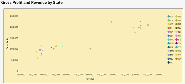
A scatter chart is used to show the correlation of two data sets that have different ranges of values. The IBM Planning Analytics Workspace (PAW) example below shows the correlation of revenue and gross profit.

IBM Planning Analytics Tips & Tricks: Scatter vs Bubble

The values associated with gross profit range from approx. 50,000 to 250,000. The values associated with revenue range from approx. 350,000 to 850,000. The scatter chart allows you to put these two different data sets onto the same chart and therefore see patterns. In this case, we see a positive correlation between larger revenue and larger profit … thereby telling us that our indirect costs are somewhat symmetrical to our direct costs.

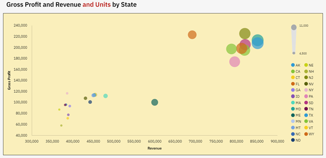
But what if we also want to know how the number of units impacts these numbers? This cannot be done on a simple two dimensional chart, but it can be done by adjusting the size of the dots within the chart. This adjustment approach is the purpose of a PAW bubble chart.

Here is the same set of data with the inclusion of units:

IBM Planning Analytics Tips & Tricks: Scatter vs Bubble

In both situations you can see the correlation in the data by looking at the patterns.  However, the bubble chart also gives you information on the units by adjusting the size of the dots.  This gives us another positive correlation between larger unit sales and larger revenue … thereby telling us that we may have the opportunity to introduce regional pricing.

As you can see, the type of chart makes a difference when reviewing your data. So how do you decide which chart to use? The simple answer is to ask yourself how many details do you want to see at once? Are you looking for two correlations or more? As long as your picture answers that question, you can never go wrong!

IBM Planning Analytics, powered by TM1, is full of new features and functionality. Need advice? Our team here at Revelwood can help. Contact us for more information at info@revelwood.com. We post new Planning Analytics Tips & Tricks weekly in our Knowledge Center and in newsletters.

Read more IBM Planning Analytics Tips & Tricks:

IBM Planning Analytics Tips & Tricks: Pie Chart Sizing

IBM Planning Analytics Tips & Tricks: The Waterfall Chart

IBM Planning Analytics Tips & Tricks: PAW Chart Padding

Home » enterprise performance management » Page 3

Filed Under: IBM Planning Analytics Tips & Tricks Tagged With: enterprise performance management, enterprise planning, Financial Performance Management, IBM Cognos TM1, IBM PAW, IBM Planning Analytics, IBM Planning Analytics Workspace, scatter chart vs bubble chart, TM1

IBM Planning Analytics Tips & Tricks: Planning Analytics Workspace (PAW) Marker Shape

July 13, 2021 by Lee Lazarow Leave a Comment

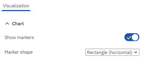
A line chart can either be a simple line or it can include markers for each data point. Most people associate a marker as a simple dot, but did you know that IBM Planning Analytics Workspace (PAW) allows you to configure the shape of the markers?

This is done by enabling the property called “Show markers’ and then defining a value for the property called “Marker Shape.” Both of these settings are found within the Chart settings of the Visualization area.

IBM Planning Analytics Workspace Marker Space

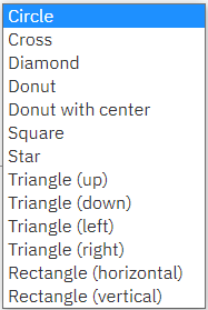
In addition to a circle, PAW offers a variety of shapes that you can use on your chart.

IBM Planning Analytics Workspace Marker Shape

This flexibility allows you to customize your line charts and enhance your end user experience.

IBM Planning Analytics, powered by TM1, is full of new features and functionality. Need advice? Our team here at Revelwood can help. Contact us for more information at info@revelwood.com. We post new Planning Analytics Tips & Tricks weekly in our Knowledge Center and in newsletters.

Read more IBM Planning Analytics Tips & Tricks:

IBM Planning Analytics Tips & Tricks: PAW Chart Padding

IBM Planning Analytics Tips & Tricks: Planning Analytics Workspace Tab Icons

IBM Planning Analytics Tips & Tricks: Planning Analytics Workspace Tab Colors

Home » enterprise performance management » Page 3

Filed Under: IBM Planning Analytics Tips & Tricks Tagged With: enterprise performance management, enterprise planning, Financial Performance Management, IBM PAW, IBM PAW marker, IBM Planning Analytics, IBM Planning Analytics Workspace, IBM Planning Analytics Workspace marker

IBM Planning Analytics Tips & Tricks: 445

July 6, 2021 by Lee Lazarow Leave a Comment

Tips & Tricks

Time is an important aspect when implementing planning models. Calculations often use time to spread an annual amount throughout the year. However, the definition of “spread” does not always entail a simple approach.

Sometimes clients want to spread an annual value evenly through the year, which leads to an easy “divide by 12” calculation. But sometimes clients want to spread the values based on weeks. This is where calculations get a bit more complicated.

A standard year includes 52 weeks. However, not all months contain the same number of weeks and we do not want the spread to include any decimals. As a result, we cannot simply divide 52 by 12 months. We can, however, easily divide 52 by 4 quarters and calculate that each quarter has 13 weeks.

But we again face the same challenge since 13 weeks divided by 3 months results in a value with decimals. This is where accounting standardization comes into play. There are three standard methods to determine how to spread the number of weeks throughout a quarter.

  • 4-4-5
  • 4-5-4
  • 5-4-4

Each of these methods define how many weeks are in the first month, how many weeks are in the second month, and how many weeks are in the third month. For example, the 4-4-5 method ensures that a calendar based year always has 4 weeks of data in fiscal January, 4 weeks of data in fiscal February, and 5 weeks of data in fiscal March.

There are advantages and disadvantages to this approach:

Advantages:

  • Comparisons are easy since the end date of the period is always the same day of the week
    • Every period is the same length which makes quarter vs. quarter comparisons useful
    • Comparisons can easily be made to the same period in the prior year
    • Comparisons can easily be made to a similar period in a different quarter
  • Since the number of weeks in a month are consistent, it is very easy to calculate weekly averages

Disadvantages:

  • Month by month comparisons are flawed because one month is 25% longer than the other two
  • The year only includes 364 days (7 days x 52 weeks), so a 53rd week will need to be added every five or six years … which can make year over year comparisons difficult
  • This approach can also lead to other complex accounting practices such as accruals

IBM Planning Analytics, powered by TM1, is full of new features and functionality. Need advice? Our team here at Revelwood can help. Contact us for more information at info@revelwood.com. We post new Planning Analytics Tips & Tricks weekly in our Knowledge Center and in newsletters.

Read more IBM Planning Analytics Tips & Tricks:

IBM Planning Analytics Tips & Tricks: Excel’s NETWORKDAYS Function

IBM Planning Analytics Tips & Tricks: The Excel DATE Function

IBM Planning Analytics Tips & Tricks: Rule Timestamps

Home » enterprise performance management » Page 3

Filed Under: IBM Planning Analytics Tips & Tricks Tagged With: Cognos, enterprise performance management, enterprise planning, Financial Performance Management, IBM Planning Analytics, planning models, spread values

IBM Planning Analytics Tips & Tricks: PAW Chart Padding

June 29, 2021 by Lee Lazarow Leave a Comment

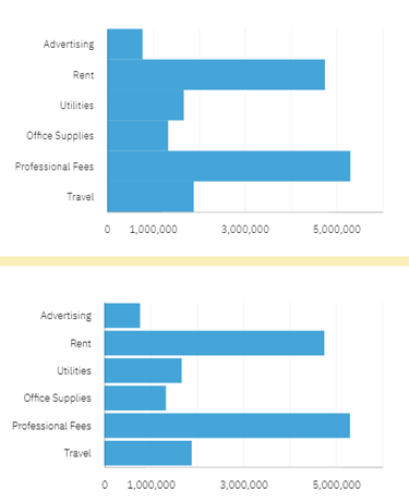
Did you know that IBM Planning Analytics Workspace (PAW) offers a feature calling “padding” which defines lines are separated within a chart? The concept of padding is the equivalent of defining white space in between the lines (e.g., no padding) or making the lines touch the lines above and below (e.g., padding).

The setting is located within the chat area of the visualization properties. It is defined as a binary option so you can choose to enable it or disable it.

IBM Planning Analytics Tips & Tricks: PAW Chart Padding

Here is an example of the same chart via both options. The chart on the top has padding enabled (e.g., the option is not checked) and the chart on the bottom has padding disabled.

By defining whitespace around your charts, you make your data more readable.

IBM Planning Analytics, powered by TM1, is full of new features and functionality. Need advice? Our team here at Revelwood can help. Contact us for more information at info@revelwood.com. We post new Planning Analytics Tips & Tricks weekly in our Knowledge Center and in newsletters.

Read more IBM Planning Analytics Tips & Tricks:

IBM Planning Analytics Tips & Tricks: Pie Chart Sizing

IBM Planning Analytics Tips & Tricks: IBM Planning Analytics Workspace Tab Icons

IBM Planning Analytics Tips & Tricks: IBM Planning Analytics Workspace Tab Colors

Home » enterprise performance management » Page 3

Filed Under: IBM Planning Analytics Tips & Tricks Tagged With: Cognos, enterprise performance management, enterprise planning, Financial Performance Management, IBM Planning Analytics, IBM Planning Analytics charts, IBM Planning Analytics PAW, IBM Planning Analytics Workspace, TM1

IBM Planning Analytics Tips & Tricks: Pie Chart Sizing

June 22, 2021 by Lee Lazarow Leave a Comment

Tips & Tricks

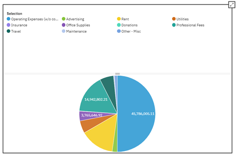
Did you know that IBM Planning Analytics Workspace (PAW) allows you to “split” your pie chart widget to define how much of the space is allocated to the legend and how much of the space is allocated to the chart? 

While in edit mode, you can view and modify the split by moving your mouse over the widget. You will then see a bar appear that can be used to resize the split.

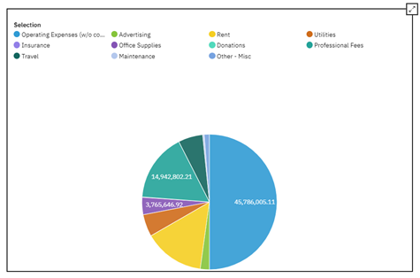
Here is an example of a chart with a legend:

Pie Chart Sizing in IBM Planning Analytics

Here is the same chart with my mouse hovering in the legend area of the widget:

IBM Planning Analytics Tips: Pie Chart Sizing

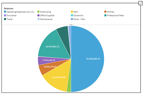
And here is the result of dragging the bar up:

IBM Planning Analytics Tricks: Pie Chart Sizing

You can see that the chart is now larger since less area was allocated to the legend.

Interested in learning more about charts and graphs in IBM Planning Analytics Workspace? Watch our webinar, “Best Practices When Using IBM Planning Analytics Workspace Charts.”

IBM Planning Analytics, powered by TM1, is full of new features and functionality. Need advice? Our team here at Revelwood can help. Contact us for more information at info@revelwood.com. We post new Planning Analytics Tips & Tricks weekly in our Knowledge Center and in newsletters.

Read more IBM Planning Analytics Tips & Tricks:

IBM Planning Analytics Tips & Tricks: Planning Analytics Workspace (PAW) Tab Icons

IBM Planning Analytics Tips & Tricks: Planning Analytics Workspace (PAW) Tab Colors

IBM Planning Analytics Tips & Tricks: Planning Analytics Workspace (PAW) Gridlines

Home » enterprise performance management » Page 3

Filed Under: IBM Planning Analytics Tips & Tricks Tagged With: enterprise performance management, enterprise planning, IBM Cognos TM1, IBM PAW, IBM Planning Analytics, IBM Planning Analytics charts, IBM Planning Analytics graphs, IBM Planning Analytics Workspace, IBM Planning Analytics Workspace charts, IBM Planning Analytics Workspace graphs, TM1 administration

Workday Adaptive Planning Tips & Tricks: Where Did My Parameters Go?

June 16, 2021 by Michelle Song Leave a Comment

Did you ever wonder where did your parameter go after you added it to a report in Workday Adaptive Planning? This post will help you find your parameters.

A parameter is helpful in matrix reports and can be used to filter your data for a specific interaction. Any report element can be added as a parameter in matrix reports. See the example below.

You can add “Timespan” as a parameter by Modified Report – Drag the Timespan element and drop it in the Parameters section. Then run the report.

Workday Adaptive Planning Tips & Tricks: Parameters

After you run the report, you will not see the Timespan parameter right away. This is because a report will only show two parameters at time. You can click on the “Change Parameters” icon and it will bring you to all parameters. The orders of the parameters in the modify report mode will define the orders of the parameters displayed in the report.

Adaptive Planning Tips & Tricks: Parameters

Workday Adaptive Planning Tips: Parameters

Incorporating parameters into your Workday Adaptive Planning reports make them more useful and user-friendly.

Visit Revelwood’s Knowledge Center for our Workday Adaptive Planning Tips & Tricks or sign up here to get our Workday Adaptive Planning Tips & Tricks delivered directly to your inbox. Not sure where to start? Our team here at Revelwood can help! Contact us info@revelwood.com for more information.

Read more Workday Adaptive Planning Tips & Tricks:

Workday Adaptive Planning Tips & Tricks: Save Personal Views on Sheets with Dashboard

Workday Adaptive Planning Tips & Tricks: Interactive Dashboards – Dynamic Planning with Embedded Sheets

Workday Adaptive Planning Tips & Tricks: Override Formulas in Sheets

Home » enterprise performance management » Page 3

Filed Under: Workday Adaptive Planning Tips & Tricks Tagged With: enterprise performance management, enterprise planning, Financial Performance Management, Workday Adaptive Planning, Workday Adaptive Planning Tips & Tricks

IBM Planning Analytics Tips & Tricks: Planning Analytics Workspace Tab Icons

June 15, 2021 by Lee Lazarow Leave a Comment

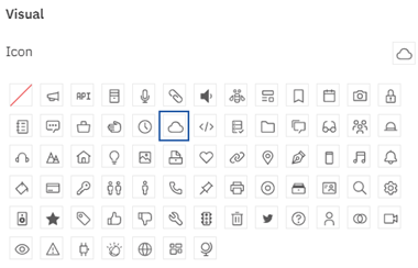
Have you ever created an IBM Planning Analytics Workspace (PAW) book and wanted to include images within each tab? PAW version 57 introduced settings that allow you to control details about the tabs. Some of these settings allow you to insert icons into the tab name. This is done via two steps.

The first step is to define the icon you want to use. This setting is found within the Individual Tab Properties and is defined independently for each tab. 

IBM Planning Analytics Tips & Tricks: PAW Tab Icons

An icon can be used in addition to the text or it can be used as a replacement. Here are examples of tabs that show text-only, text-with-icon, and icon-only:

IBM Planning Analytics Tips & Tricks: Planning Analytics Workspace Icons

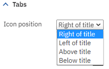
The second setting defines where the icons will be positioned in relation to the text. This setting is found within the Dashboard Properties and is defined once for the entire book.

IBM Planning Analytics Tips: PAW Tab Icons

Here is an example of a tab which uses red text, includes the light bulb icon (called “idea”) and has the icon located above the title:

IBM Planning Analytics Tricks: PAW Tab Icons

These new settings give you more control of the tab details within your PAW books and can be used to further optimize your user experience.

IBM Planning Analytics, powered by TM1, is full of new features and functionality. Need advice? Our team here at Revelwood can help. Contact us for more information at info@revelwood.com. We post new Planning Analytics Tips & Tricks weekly in our Knowledge Center and in newsletters.

Read more IBM Planning Analytics Tips & Tricks:

IBM Planning Analytics Tips & Tricks: PAW Tab Colors

IBM Planning Analytics Tips & Tricks: PAW Gridlines

IBM Planning Analytics Tips & Tricks: Change Element Types in PAW

Home » enterprise performance management » Page 3

Filed Under: IBM Planning Analytics Tips & Tricks Tagged With: enterprise performance management, enterprise planning, Financial Performance Management, IBM Cognos TM1, IBM PAW, IBM Planning Analytics, IBM Planning Analytics Workspace, TM1

IBM Planning Analytics Tips & Tricks: Accessing Books

June 8, 2021 by Dillon Rossman Leave a Comment

Tips & Tricks

Did you know that there are now two ways to access books in IBM Planning Analytics Workspace (PAW)?  

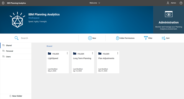
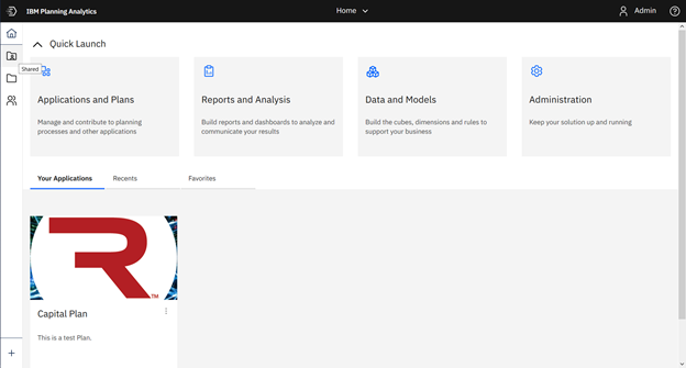
Previously, you could access books via the “Shared”, “Personal”, and “Users” folders in the bottom section of the home page.

IBM Planning Analytics Tips & Tricks: Accessing Books

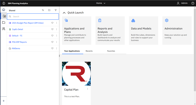
This option still exists but it looks a little different. As of PAW update 57, these folders are now located within the toolbar on the left of the home page. Simply select the folder you would like to access and a new pane containing its contents will be displayed.

IBM Planning Analytics Tips: Accessing Books
IBM Planning Analytics Tricks: Accessing Books

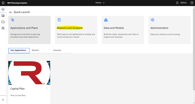
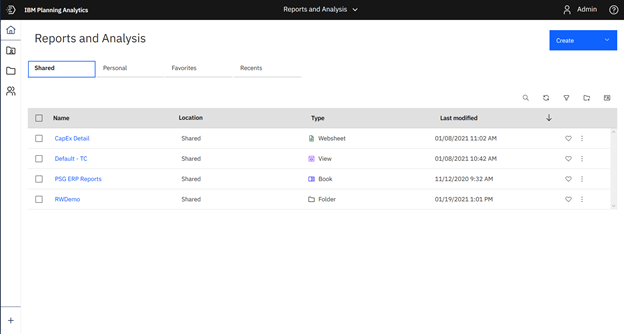
The new option is via the “Reports and Analysis” tile. Click on the tile and it will launch the new “Reports and Analysis” page. From here you can see any shared or personal books, as well as anything favorited or recently used.

Accessing Books in IBM Planning Analytics Workspace
Learn How To Access Books in IBM Planning Analytics

This new approach gives users multiple ways to quickly access books: via the new toolbar or via “Reports and Analysis” (where more detailed information and options are available).

IBM Planning Analytics, powered by TM1, is full of new features and functionality. Need advice? Our team here at Revelwood can help. Contact us for more information at info@revelwood.com. We post new Planning Analytics Tips & Tricks weekly in our Knowledge Center and in newsletters.

Read more IBM Planning Analytics Tips & Tricks:

IBM Planning Analytics Tips & Tricks: Create New Books with the Diamond Icon

IBM Planning Analytics Tips & Tricks: PAW Pass Context

IBM Planning Analytics Tips & Tricks: Home Button

Home » enterprise performance management » Page 3

Filed Under: IBM Planning Analytics Tips & Tricks Tagged With: Cognos TM1, enterprise performance management, Financial Performance Management, IBM Cognos TM1, IBM PAW, IBM Planning Analytics, IBM Planning Analytics Workspace, TM1 web

  • « Go to Previous Page
  • Page 1
  • Page 2
  • Page 3
  • Page 4
  • Page 5
  • Interim pages omitted …
  • Page 8
  • Go to Next Page »

Footer

Revelwood Overview

Revelwood helps finance organizations close, consolidate, plan, monitor and analyze business performance. As experts in solutions for the Office of Finance, we partner with best-in-breed software companies by applying best practices guidance and our pre-configured applications to help businesses achieve their full potential.

EXPERTISE

  • Workday Adaptive Planning
  • IBM Planning Analytics
  • BlackLine

ABOUT

  • Who We Are
  • What We Do
  • How We Help
  • How We Think
  • Privacy

CONNECT

World Headquarters

Florham Park, NJ | 201 984 3030

European Headquarters

London & Edinburgh | +44 (0)131 240 3866

Latin America Office

Miami, FL | 201 987 4198

Email
info@revelwood.com

Copyright © 2025 · Revelwood Inc. All rights reserved. Revelwood® and the Revelwood logo are registered marks of Revelwood Inc.