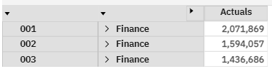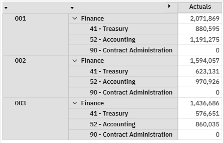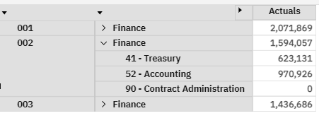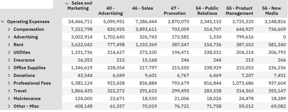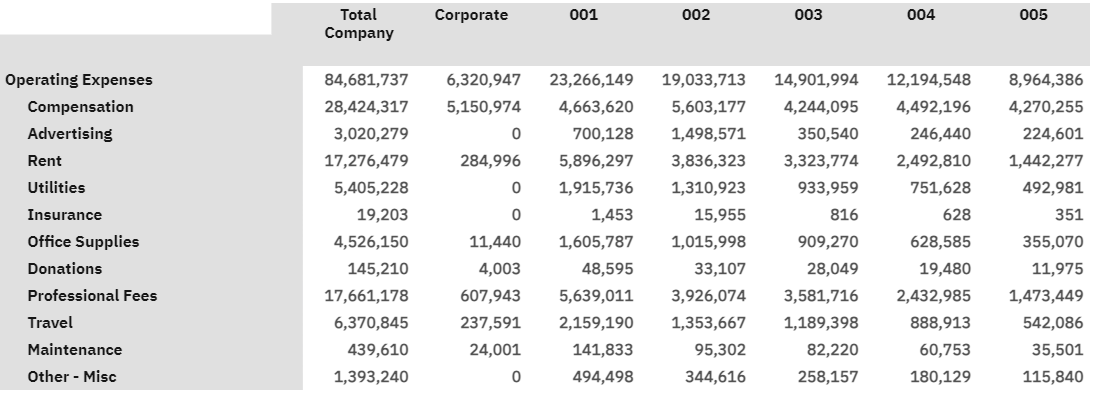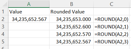
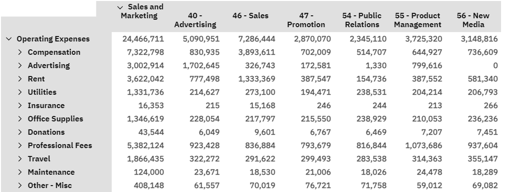
The great thing about explorations is that data appears in a simple grid-like format. This allows you to easily look at your data in an easy-to-read format that is similar to an Excel spreadsheet.
In the example below, it’s easy for your eyes to move up and down to see the expenses and then move left and right to see the departments. And since each data point is within its own box, it’s easy for your eyes to know when to stop.
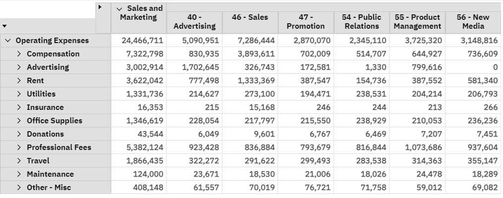
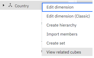
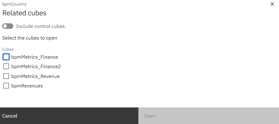
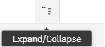
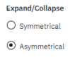
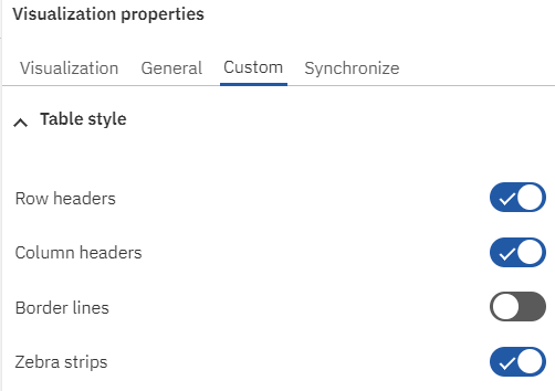
However, the use of boxes for the data also puts boxes in the headers. For some people, the lack of symmetry does not matter. But for those who do not like this look, you can turn off all border lines via a single click within the “Custom” properties of an exploration:
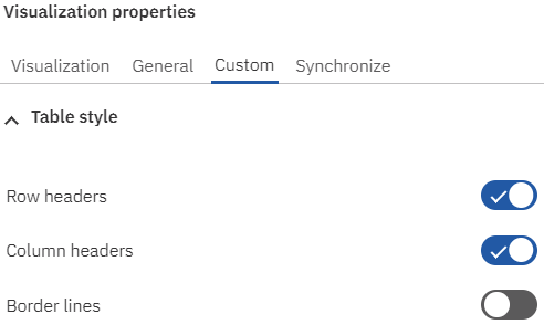
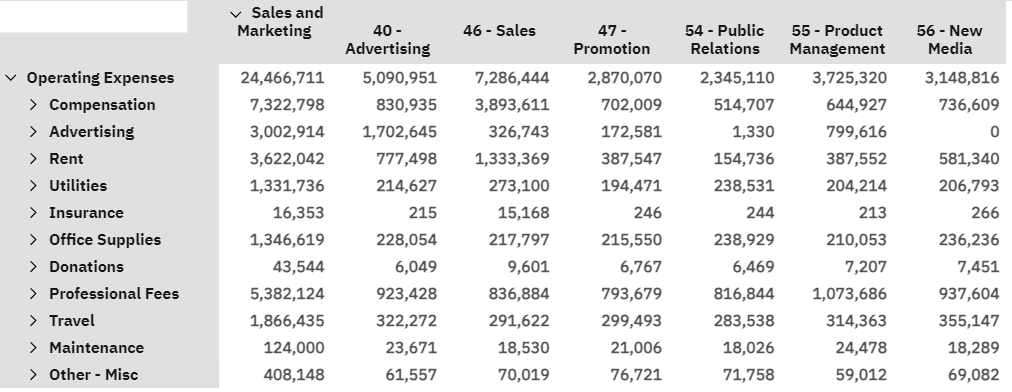
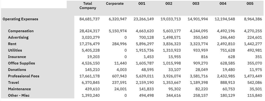
Disabling the border will convert the example above into a display with no lines in either the data or the headers.
Once completed, you can also set the formatting to shade every other line using an approach called “Zebra Strips”.
IBM Planning Analytics, which TM1 is the engine for, is full of new features and functionality. Not sure where to start? Our team here at Revelwood can help. Contact us for more information at info@revelwood.com. And stay tuned for more Planning Analytics Tips & Tricks weekly in our Knowledge Center and in upcoming newsletters!
Read more IBM Planning Analytics Tips & Tricks:
IBM Planning Analytics Tips & Tricks: How We Solve Problems
IBM Planning Analytics Tips & Tricks: Identifying a Specific Dimension
IBM Planning Analytics Tips & Tricks: Asymmetrical Expand in PAW