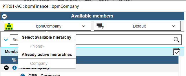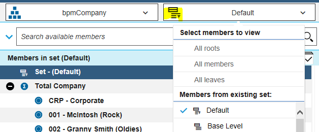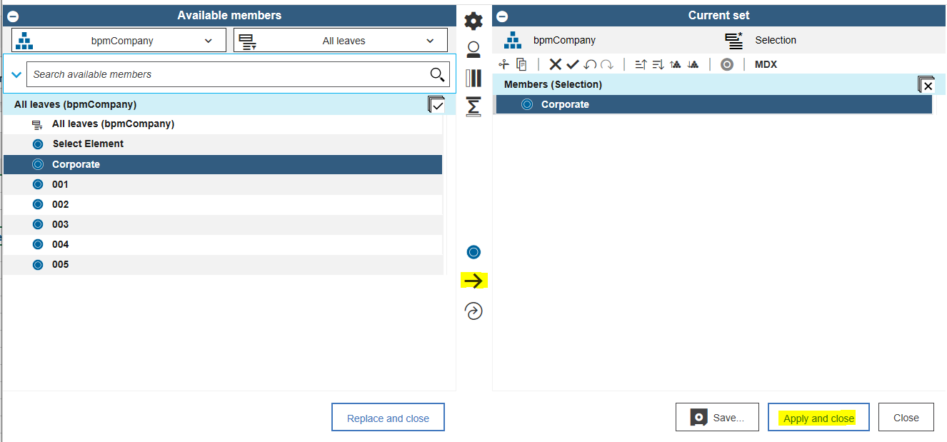
Ventana Research has named IBM Planning Analytics with Watson a Value Index Leader in the firm’s Business Planning Value Index: 2022 Vendor and Product Assessment. The firm evaluated IBM Planning Analytics with Watson, along with planning products from Anaplan, Board International, Infor, insightsoftware, OneStream Software, Oracle, Planful (formerly Host Analytics), Prophix, SAP, Unit4, Vena Solutions, Wolters Kluwer and Workday.
IBM was categorized as an Exemplary Vendor, ranking first overall in the Value Index. Additional rankings by IBM Planning Analytics include:
- Ranking second in Product Experience
- Ranking Second in Customer Experience
- Named as a Value Index Leader in TCO/ROI
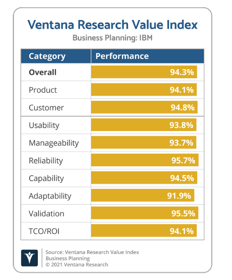
The purpose of the report is to “evaluate the maturity of software vendors and products and their value for enterprise use in business planning.” It is designed to provide a “balanced perspective of vendors and products that is rooted in an understanding of business drivers and needs.” Ventana uses research-based analytics and methodology to generate the Value Index ratings. The firm then “builds to a set of indicators it presents in both analytic and graphic form, each depicting the value of a specific vendor’s offering in terms of what it can deliver relevant to business planning needs.”
According to Ventana, “Technology is essential to making planning and budgeting more strategic, more strategic, more productive and more consequential to an organization’s success.”