So many webinars, so little time! If you are like me, you probably receive invitations to webinars on a regular basis. Some of them even make it onto my calendar. Unfortunately, more often than not, I have the best intentions of attending a webinar, but then can’t make the live event.
That’s what on-demand webinars are for!
Did you know Revelwood has a YouTube playlist of all our IBM Planning Analytics / TM1 webinars? To date, we have 27 webinars available for viewing when convenient for you.
Let’s take a look at two of our more popular webinars.
Best Practices When Using Planning Analytics Workspace Charts
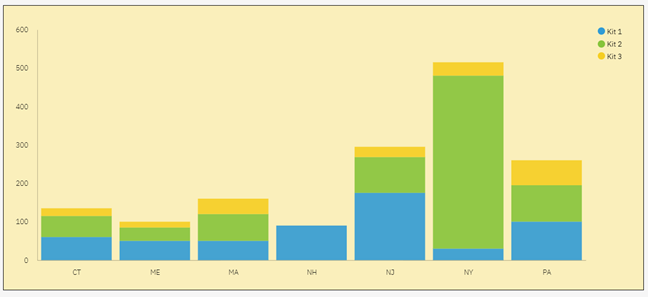
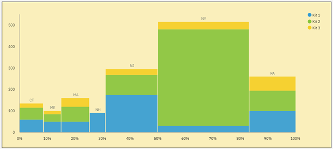
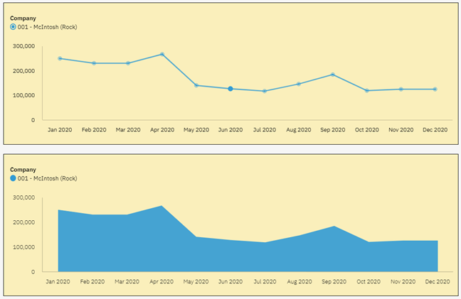
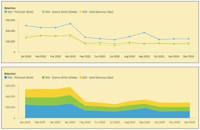
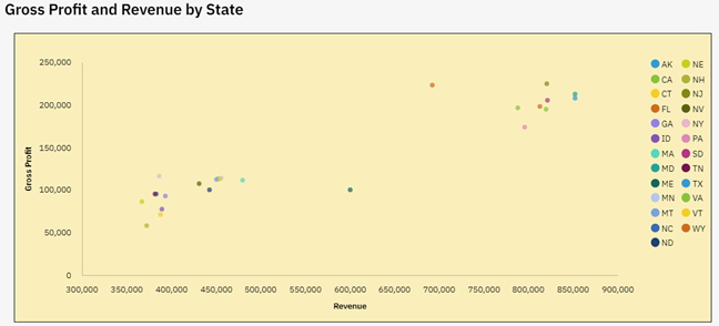
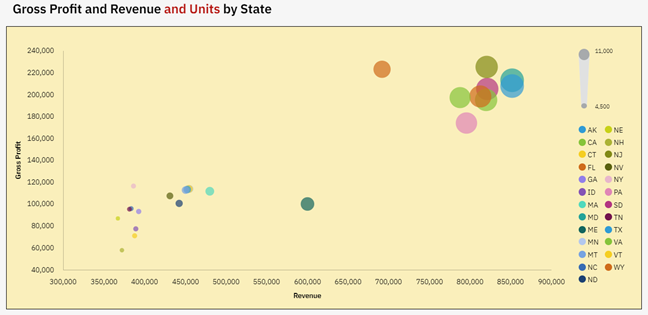
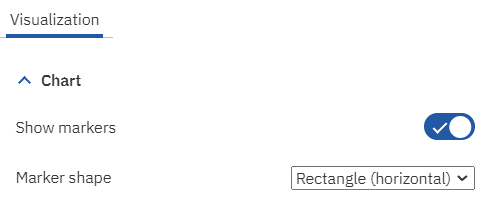
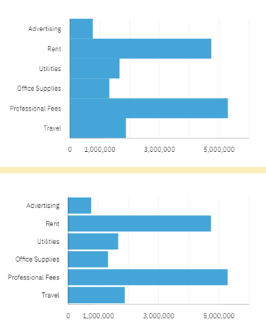
Charts and graphs are an excellent way to illustrate relationships in data and to highlight trends. They are visualizations of data that allow end users to quickly analyze a large amount of data. To make the biggest impact, it is important to choose the right chart for the use case of the data.
Watch this on-demand webinar to learn about using the following charts in IBM Planning Analytics Workspace (PAW):
- Area charts
- Bar charts
- Stacked bar charts
- Column charts
- Stacked column charts
- Line charts
- Map charts
- Packed bubble charts
- Pie charts
- Point utilization charts
- Radial charts
Creating PAW Charts Using the New Experience
The new experience in IBM Planning Analytics introduced new visualizations in PAW. In this webinar we review various methods to create a chart. We also offer recommendations on building dashboards and reporting pages.
During this webinar we explain and demonstrate:
- The types of charts that are available and when to use each
- How to create a chart from an existing exploration
- How to create a chart from scratch
- How to customize your charts
- Recommendations when creating charts and dashboards
Learn More About Charts in IBM Planning Analytics
We have even more resources for you on creating charts in Planning Analytics! On Wednesday, March 15, 2023 at 1:00pm ET we will be hosting a live webinar on waterfall charts in Planning Analytics.
A waterfall chart is a form of data visualization that helps in understanding the cumulative effect of sequentially introduced positive or negative values.
Join Lee Lazarow and Terry Kerans to learn:
- What a waterfall chart can tell you
- When to use a waterfall chart
- How to create a waterfall chart in PAW
IBM Planning Analytics, which TM1 is the engine for, is full of new features and functionality. Not sure where to start? Our team here at Revelwood can help. Contact us for more information at info@revelwood.com. And stay tuned for more Planning Analytics Tips & Tricks weekly in our Knowledge Center and in upcoming newsletters!
Read more IBM Planning Analytics Tips & Tricks:
IBM Planning Analytics Tips & Tricks: Excel Tips, Part 2