Did you know you can now create control objects in IBM Planning Analytics Workspace (PAW) with update 76? This includes control cubes, control dimensions, and control processes. Previously, creating your own control objects required a TurboIntegrator (TI) process. Now it can be done with a click of a button in PAW.
To create a control object, first open a modeling workbench. Once you are in the workbench, right click on “Control Objects” on the left pane. You will see options to create the various types of control objects.
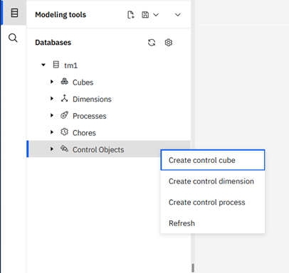
This will launch a wizard that prompts you to name your control object. If you select a control cube it will also prompt you to select dimensions for the cube.
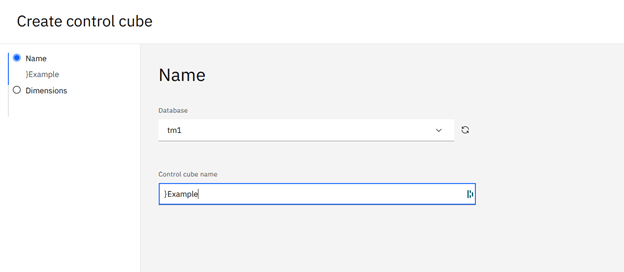
Control dimensions and processes will only ask for name.
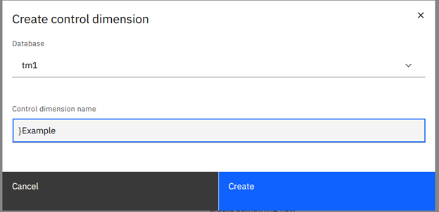
Once you hit “Create” you will have a new control object without having to use a TI process.
Revelwood has worked with IBM Planning Analytics / TM1 for more than 27 years. We’ve partnered with hundreds of companies on the design, development, maintenance and updates of IBM Planning Analytics applications, across every industry. Have a challenge with Planning Analytics / TM1? We can help you!
Read more IBM Planning Analytics Tips & Tricks:
IBM Planning Analytics Tips & Tricks: Updating ODBC Connections for Multiple Processes
IBM Planning Analytics Tips & Tricks: PAx Control Objects
IBM Planning Analytics Tips & Tricks: Customizing Background Colors for Data and Header Cells